| Author | Thread |
|
|
04/20/2003 11:26:41 PM |
Critique Club Comments by Grayce
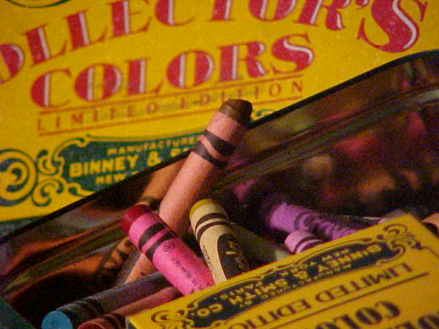
Greetings! Your image certainly meets the "Colors" challenge! Furthermore the subject you chose is one that most people can relate to, regardless of age, since we've all been there. That gives this a universal appeal.
The composition is good, making use of diagonals. That just adds something to a picture.
The color saturation is fine. There appears to be a little digital noise. This can be fixed with a free program called Neat Image....look it up in Google when you get a chance.
Exposure is good, whatever lighting you used.
There seems to be a problem with blurriness. Using a tripod should eliminate that. It's very difficult to get a sharply focused closeup without one.
Overall a good idea, and an image of merit. Needs a bit of work.
Good luck in all your photographic endeavors.
Regards,
Grayce |
|
Comments Made During the Challenge  |
|
|
04/13/2003 09:56:39 PM |
|
Limited edition. . .wow. Focus distracts from a great shot. |
|
|
|
04/12/2003 09:17:03 PM |
|
nice thought with the used box and all. i enjoyed this |
|
|
|
04/12/2003 12:49:10 PM |
|
Nice composition. Maybe a little more saturation. |
|
|
|
04/11/2003 10:48:07 AM |
|
|
|
04/10/2003 04:24:41 PM |
|
Alot of grain, which is distracting to my eyes. |
|
|
|
04/09/2003 01:32:24 PM |
|
|
|
04/09/2003 10:30:57 AM |
|
Great title! The image is interesting, the colors are very pastel like and the graininess actually works well here. All in all a good image. |
|
|
|
04/09/2003 03:57:35 AM |
|
Grainy. The image seems broken up by the edge of the metal tin. |
|
|
|
04/09/2003 12:25:39 AM |
|
If anyone criticizes your graininess here, they'll have to answer to me! It belongs and adds a nostalgia that would otherwise not be as present. Well composed, too. |
|
|
|
04/08/2003 11:23:50 PM |
|
Nice shot (I almost tried one similar myself). Not sure the heavy grain adds much to the overall picture. |
|
|
|
04/08/2003 06:32:01 PM |
|
Very grainy.... easily fixable |
|
|
|
04/07/2003 11:19:07 PM |
|
|
|
04/07/2003 09:38:50 PM |
|
there seems to be a lot of noise in this picture but still good nonetheless |
|
|
|
04/07/2003 12:47:53 PM |
|
I don't like the grainy feel, but nice idea. |
|
Home -
Challenges -
Community -
League -
Photos -
Cameras -
Lenses -
Learn -
Help -
Terms of Use -
Privacy -
Top ^
DPChallenge, and website content and design, Copyright © 2001-2026 Challenging Technologies, LLC.
All digital photo copyrights belong to the photographers and may not be used without permission.
Current Server Time: 06/28/2026 08:45:20 AM EDT.