Photoshop, colors saturation, shadows and temp. croping and black frame.
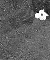
had a hard time participating in this challenge, but determined to send in a picture. I wanted to show you all how the litle things like this dove on the cross can mean to all of us, not religiously but in the whole big a picture.
Statistics
Place: 289 out of 492 Avg (all users): 5.0641 Avg (commenters): 5.8261 Avg (participants): 4.9405 Avg (non-participants): 5.1954 Views since voting: 1038 Views during voting: 449 Votes: 359 Comments: 26 Favorites: 0
a little too saturated and contrasty for me, it makes everything look flattened, though that may be what you're going for, like a cezanne painting, but then the bird looks out of place
Way over saturated, photoshop is a tool my friend that should be used as such, you've caused distortion in the edges because of the amount of saturation that you have applied.
An interesting concept, if there were something to draw the eye to the bird. As it is, the eye is drawn just about everywhere else. Also, the highlights on the snow are badly blown, making them unrealistic.
If this had been a bright red bird, such as a cardinal, or a larger one, such as a hawk, and the rest of the image were mostly desaturated and correctly exposed, that would have been much better.






 Add photograph to your favorites
 Add photographer to your favorites


