| Author | Thread |
Comments Made During the Challenge  |
|
|
04/12/2003 12:38:01 PM |
|
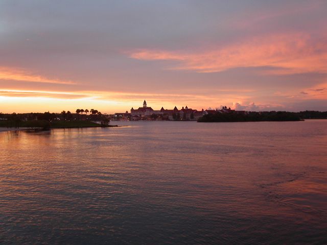
Restful. It probably would benefit from a more horizontal cropping. |
|
|
|
04/12/2003 11:55:01 AM |
|
Nice color in the reflections on the water. I like that I can see detail in the foreground and it's not just one big black silhouette. |
|
|
|
04/11/2003 10:31:16 AM |
|
Very pretty sunset! I like the colors. |
|
|
|
04/11/2003 12:06:18 AM |
|
Very nice picture. I just don't think that it fits the "color" category as well as most others. |
|
|
|
04/10/2003 08:41:56 AM |
|
Wonderful sunset (sunrise?) colors. The yellows, reds and blues create a pleasurable impact. I wouldn't have put the horizon exactly in the middle though and gone with either showing more sky or more water but not half of both. |
|
|
|
04/10/2003 12:26:02 AM |
|
Just a pretty sunset. Great color reflections, nice use of the lighting. I would half and half the positive and negative space...or used a bit more of the negative space if there were some more clouds above. |
|
|
|
04/09/2003 03:08:06 PM |
|
Since the most interesting part of the sky is toward the horizon, I'm glad you gave us lots of water to look at. Good composition. |
|
|
|
04/08/2003 07:24:15 PM |
|
|
|
04/08/2003 04:17:43 PM |
|
|
|
04/08/2003 03:11:34 PM |
|
in photos like this a little more saturation can make all the difference in the world. respond to me and i'll show you how. |
|
|
|
04/08/2003 02:21:46 PM |
|
nice job nice use of color |
|
|
|
04/08/2003 10:43:13 AM |
I think that as your title says, this is “just a sunset.” It is tough to do well with these types of pictures in challenges because I think every one of us has taken sunset pictures and I am sure we have all seen some quite spectacular ones presented. Though I think you have captured a good one, as a reviewer I have seen my share of great ones so I have a lot to compare it to. The exposure in this picture looks good but I think the composition could be improved. I would either cut out half of the water or half of the sky to make either one or the other dominate. I think you have chosen a lovely location and overall have done a good job here. I gave this one a 5.
Greg
|
|
|
|
04/08/2003 02:27:15 AM |
|
Rule of thirds since the refection is lessed by the waves. Or if you cropped the top and bottom, which seem less interesting than the middle. |
|
|
|
04/07/2003 02:33:09 PM |
|
WOW...did you use a wide angle? Just stunning looking shot..........love it..good. |
|
|
|
04/07/2003 01:57:58 AM |
|
Home -
Challenges -
Community -
League -
Photos -
Cameras -
Lenses -
Learn -
Help -
Terms of Use -
Privacy -
Top ^
DPChallenge, and website content and design, Copyright © 2001-2026 Challenging Technologies, LLC.
All digital photo copyrights belong to the photographers and may not be used without permission.
Current Server Time: 06/28/2026 08:15:15 PM EDT.