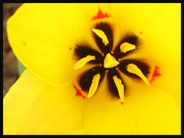
Hi Steve. First of all congratulations on your first submission to DPC. Your flower macro is very colorful and, like I mentioned in my comment below, the yellow, brown and reds complement each other very well.
The composition: I would have done one of two things here. 1) I would have either cropped out the top left hand corner, or moved in more to fill the whole frame with flower and also adjusted the focus to get a sharp detailed pic or, 2) Moved out a little to get the whole flower in the frame complete with its outlines and a uniform background all around the sides. The DOF is good so I would have prefered the second alternative.
I am looking forward to seeing more work from you in the near future.
Looks like a pansy. Maybe a little too tight. The focus is on the things in the middle and the outside of the flower is blurry. Good colors but it needs to be a little clearer
Wow impact! That yellow is very strong, it works! The brown and red complement the yellow perfectly, good shot. My only nit pick is that the background in the top left hand corner tends to pull my eyes over in that direction.
This might have worked if the background on the left had been cropped out. Then it would have been a pretty good abstract with a field of yellow with the red and black highlights and lighter shade of yellow. As it is, it comes off as an out of focus flower.
I think this shot would have looked better if the flower had filled the frame entirely. Seeing beyond the flower (at the left hand side) spoils the whole image as far as I am concerned, but the colours captured are great.
focus seems a bit soft. Very bright! the flower would be great if you could have taken this even closer so that it really filled the frame without the distraction on the left
This is an interesting picture. I love the shape of the center of the flower and the color definitely is the dominant element of the photograph so it meets the challenge well. The focus looks a bit soft to me and the petals look somewhat oversaturated to me. Composition is very good bit the brown and green in the background is distracting me. I wish the background was smoother and monochromatic. I think if you used a brown or green backdrop it would help a lot. Very good effort, I gave it a 5.






 Add photograph to your favorites
 Add photographer to your favorites

 Photographer found comment helpful.


