| Author | Thread |
Comments Made During the Challenge  |
|
|
05/03/2005 08:22:01 PM |
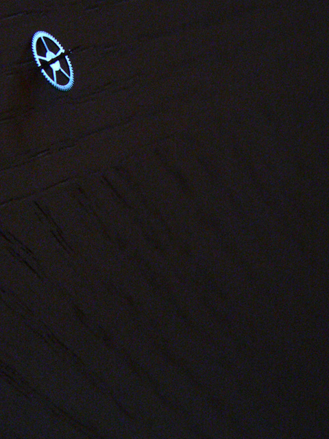
Not a bad idea, but I don't like jamming the subject as far into the corner as you have here. Also you have something in the black background that draws attention. (I thought my monitor was dirty at first :-P)
TC |
|
 Photographer found comment helpful. Photographer found comment helpful. |
|
|
05/03/2005 04:52:15 PM |
|
i like it, a watch gear? Your framing and lighting gives it an abstract feel, also I love the surface. 8 |
|
| Photographer found comment helpful. |
|
|
05/01/2005 11:27:21 PM |
|
So close -- nice composition, far too much grain. Maybe too low light, maybe too much post-processing. |
|
| Photographer found comment helpful. |
|
|
05/01/2005 07:23:04 PM |
|
Tucking the subject into the corner seems to enhance the waste of space in the rest of the image. Perhaps if your gear was closer to one of those "Rule of Thirds" spots, the effect would be minimized. |
|
| Photographer found comment helpful. |
|
|
04/30/2005 12:36:39 PM |
|
anyone can take a picture of something incredibly small in the frame, but it takes thought, imagination, and creativity to come up with something that is SMALL in the frame, but also provokes INTEREST and APPEAL to the viewers. If the shot isn't appealling, but still fits the challenge, then it isn't really a great shot, as with this one, 1 |
|
| Photographer found comment helpful. |
|
|
04/30/2005 10:56:19 AM |
|
IMO, the lighting is a little too dark. It would be nice to make out some of the detail of the wall (?) |
|
| Photographer found comment helpful. |
|
|
04/30/2005 01:22:09 AM |
|
Nice suggestion in the backround |
|
| Photographer found comment helpful. |
|
|
04/29/2005 03:09:18 AM |
|
| Photographer found comment helpful. |
|
|
04/28/2005 07:34:06 PM |
|
I basically like this composition (the lines in the deep shadows), but the focus on the gear is too soft. Don't know if that happened with resizing or ?. Be sure to use the USM (or equivalent) after resizing. It helps a great deal. |
|
| Photographer found comment helpful. |
|
|
04/28/2005 05:26:35 PM |
|
looks like a spacestation.8 |
|
| Photographer found comment helpful. |
|
|
04/28/2005 04:22:10 PM |
|
I like the color of the gear and the texture of the background. |
|
| Photographer found comment helpful. |
|
|
04/27/2005 01:07:12 PM |
|
Very good Minimalism. Would also make a great negative space photo as well. |
|
| Photographer found comment helpful. |
|
|
04/27/2005 10:21:27 AM |
|
Very unusual. And it works. |
|
| Photographer found comment helpful. |
|
|
04/27/2005 07:46:04 AM |
|
| Photographer found comment helpful. |
|
|
04/27/2005 07:31:53 AM |
|
Good idea. Like the general concept just that the eye is trying to find the point of interest. Would have tried a different crop just a little bit more centered. |
|
| Photographer found comment helpful. |
|
|
04/27/2005 06:39:08 AM |
|
| Photographer found comment helpful. |
Home -
Challenges -
Community -
League -
Photos -
Cameras -
Lenses -
Learn -
Help -
Terms of Use -
Privacy -
Top ^
DPChallenge, and website content and design, Copyright © 2001-2026 Challenging Technologies, LLC.
All digital photo copyrights belong to the photographers and may not be used without permission.
Current Server Time: 06/30/2026 05:45:51 PM EDT.