Critique Club:
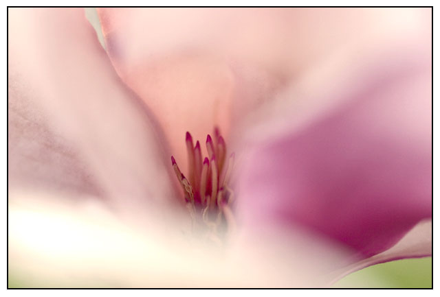
The image burns out on the left. If it had the same green color on the left as on the right it would be much better. The focus, composition, contrast is good. And the border is also good.
Maby using the dodge tool on the thing in the middle and make it a litle lighter. Not sure though. Just what I think.
I like the soft light and subtle colors. The blur at the front is a little distracting to me and also seems overexposed, which draws my attention even more.
I like this photo but the brightness seems a little distracting to me. I do like the softness. It gives it a certain feeling. You might try to take some of the brightness out if possible. Good luck and nice work.
Well seen and captured. I think I would have tried to avoid that front bottom petal though--it's bright enough and big enough to distract. I love the very selective focus and blur. I think cropping the left, up until the end of the petal where there's a space between the petals at the top left, might have brought out the painterly feel even more.
i have an odd attraction for this image. i don't know what keeps bringing me back, but i do like it. maybe it's the colors. who knows? i just hope others will take the time to appreciate the image you've rendered here. good luck!






 Add photograph to your favorites
 Add photographer to your favorites


 Photographer found comment helpful.


