I can honestly say that while this is definately different...it doesn't do much for me.
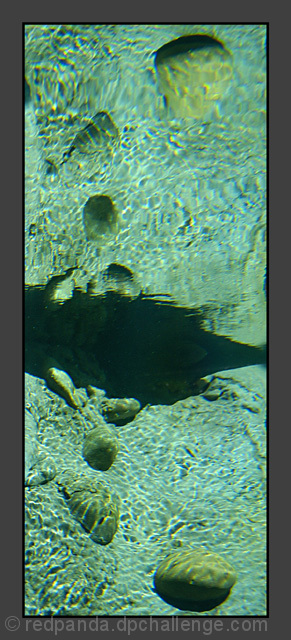
The only real area of interest is the rock in the bottom right and it's really not clear enough to focus on. The reflection of the rock is distorted and blurred as well, and that's really where I look first before looking in the bottom right.
The large black blob in the center does not add to the photo in my opinion at all either. It seems to have a pixeled area in the center of it and lacks any real purpose except to seperate the photo in 1/2.
Speaking of seperating the photo in 1/2, I think that it's seperated in a bad place. Dead center is a bad 'horizon' spot, and this is no exception despite not being a real horizon at all.
You've heard it before, the border is aweful. Why did you chose grey? And why so huge? I think a simple thin border would have worked much more effectively on this.
I think it may make an interesting abstract, but it's not really my kind of thing. Please take this as only one opinion, as I'm sure you and many others are more into abstract feeling photos.
~Heather~
uh oh - the "border patrol" is going to hate this border. It seems to wide and too grey to me. Also the border color is a warm grey and the water colors arre all cool.





 Add photograph to your favorites
 Add photographer to your favorites

 Photographer found comment helpful.


