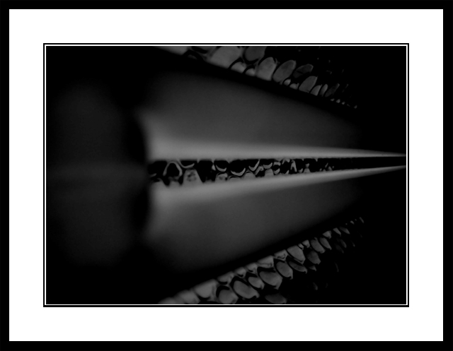
This is a macro-shot of the hanging lamp over my desk. The background shows the dented hood of the lamp. In PS I removed dust & scratches and I lifted the contrast.
Statistics
Place: 165 out of 226 Avg (all users): 4.7337 Avg (commenters): 5.6316 Avg (participants): 4.7586 Avg (non-participants): 4.6988 Views since voting: 1124 Votes: 199 Comments: 21 Favorites: 0
Now, this is a true abstract. Voters dislike not knowing what something is, and they tend to vote lower than they would if you gave a clue as to what this is. lol, believe me, I am having the same problem right now on one of the challenges.
Anyway, on to your picture. The one thing you could have done to improve your score was to give more of a hint as to what this is.
I think a lot of people would have complained about how dark this photo is as well. So better lighting would have helped a bit.
It also looks a bit.. blurry, which means points were removed because of that.
Personally I like this shot. I like abstracts though.
Good luck in the next challenges
-Annida
"In PS I removed dust & scratches and I lifted the contrast"
You do realize that removing dust and scratches violates the rules of the challenges? Unless you're using some techinque that affects the entire picture, that's considered spot editing. I appologize in advance if you removed them by some other means.
Way too much framing/bordering for me, and I can't make out what's going on: IMO, abstract images need to be really special to work with odd focus - especially b/w shots. Yes, it meets the idea of 'symmetry' - but in a very straightforward way, not really a compositional way.
Not certain exactly what I'm looking at here, but the symmetry is great. Subdued tones add a nice touch. Bold border contrasts well with the overall grey of the shot.
I can't figure it out, but I like it. Shapes and texture are the key elements for me. I usually think borders are awful, but this treatment really adds to the overall image.





 Add photograph to your favorites
 Add photographer to your favorites

 Photographer found comment helpful.


