Initial thoughts Very colorful, meets the challenge, burnout hurts it, should have scored better.
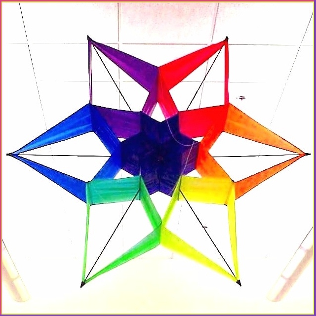
Composition/ Content You had a great idea here that seems was very hard to pull off. Most librarians don't like you hanging from ceilings and such so you do what you can. I assume that you were trying to cut out the background by overexposing it. It works on some level but becomes distracting on another. I love the symettry and color but that background really hurt this shot.
Technical Focus seems a bit soft but I'm sure that was because of the difference in light and shadow you have here. The only thing I might have done was use a higher numbered (smaller)aperture and see what happened. This is a poster child for a bracketed shot as well. That would have smoothed some of your burnout and made a more appealing shot IMHO. I'm not sure if your camera has these capabilities.
My Opinion On The Photo I originally scored this shot a six bordering on a seven. I think that it meets the challenge well but could have been improved a little to finish even higher than it did. I'm a little surprised it didn't finish a little higher. Good job, and keep up the good work.
I would be happy to talk further about this shot if you would like to contact me.
DougPaz
I kinda like the high key background. I think it would work better if it were just whit with no lines, but the way you've done it you've minimized the lines and it really brings out the bright colors of the kite. Good job with that
Nice idea; 6 lines of symmetry! I'm coming down hard on non-symmetric images in this week's competition - you've nothing to worry about here, in other words :)





 Add photograph to your favorites
 Add photographer to your favorites


 Photographer found comment helpful.


