| Author | Thread |
Comments Made During the Challenge  |
|
|
04/18/2005 03:49:43 PM |
|
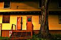
I think a touch of saturation would have made the colors more vibrant. Perhaps cropping or altering shot so tree was in the middle would have kept it from ditracting from the shot. Perhaps it could have framed the right side of the building better. |
|
 Photographer found comment helpful. Photographer found comment helpful. |
|
|
04/18/2005 10:11:45 AM |
|
This is very pretty! I lobe this shot , the building is very cute and the grass and vines look neat. |
|
| Photographer found comment helpful. |
|
|
04/17/2005 10:43:18 PM |
|
Very nice composition and lighting. Like the reflection in the window. |
|
| Photographer found comment helpful. |
|
|
04/15/2005 02:09:51 AM |
|
This is a great shot. Good job. |
|
| Photographer found comment helpful. |
|
|
04/14/2005 09:41:37 AM |
|
Perhaps from a different angle would have made for a nicer shot. I find the tree in the dead center of the shot to be very distracting and takes away the focus of what the shot is supposed to be about. I also find the contrast from the building makes the photo appear to be a little OoF. Good luck with this challenge. |
|
| Photographer found comment helpful. |
|
|
04/13/2005 09:35:40 PM |
|
Beautiful composition..I love your crop, the bit off roof is really striking, as is the greenery. Well done. |
|
| Photographer found comment helpful. |
|
|
04/13/2005 06:27:36 PM |
|
I like the color in this photograph, and the softer focus. Great composition. Really looks abandoned. |
|
| Photographer found comment helpful. |
Home -
Challenges -
Community -
League -
Photos -
Cameras -
Lenses -
Learn -
Help -
Terms of Use -
Privacy -
Top ^
DPChallenge, and website content and design, Copyright © 2001-2026 Challenging Technologies, LLC.
All digital photo copyrights belong to the photographers and may not be used without permission.
Current Server Time: 06/29/2026 06:36:13 PM EDT.