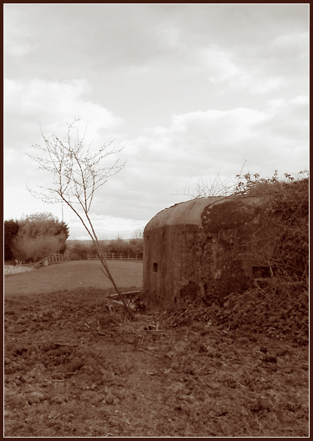
In this photo, I personally have no clue what I'm looking at. I've never seen anything like this in person and don't recognize it from your photo.
I like the tones and colors. I think it makes it feel older and seem like an old photo from someone's album of old.
Focus is a bit soft, as I think someone else mentioned. It makes it a little harder to figure out what I'm looking at in the photo. You know, even though I don't know the subject, it still feels old and abandoned. I think that is a great accomplishment.
I like the framing/cropping. It feels like the little tree kind of forces the crop to the left, which is a good thing cause I like how the subject is off to the right with the extra space to the other 3 sides. The ground, the sky and the area to the left with the tree.
This is an appealing image to look at. Not too busy, not too plain.
Lighting seems to have been good for the image as well. Very nice sky.
~Heather~
The deep sepia obsures the details that are available in this image. By lightening the tone, the detail will emerge and the veiwer doesn't need to work to capture the feel, mood, emotion that should come easily. The contrast between the grey tones in the sky and the sepia in the forground difficult to visually accept (By the way, IMO)
The sepia tone fits the age of the structure, but with that gorgeous cloud-filled sky and the green pasture in the background, I almost wish it was in color.





 Add photograph to your favorites
 Add photographer to your favorites


 Photographer found comment helpful.


