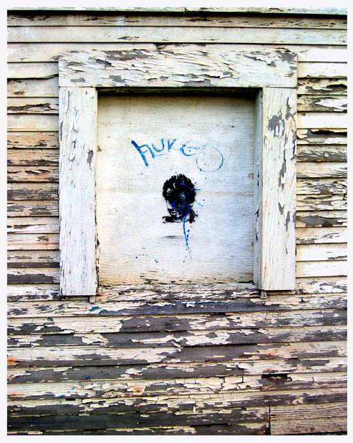
Interesting artistic interpretation to the challenge with the artwork on the boarded-up window. A bit on the contrasty side and a slightly lower point of view (shooting angle) woud have helped the lower boards be a bit more horizontal. (4)
The contrast in the picture is a little bright and makes the picture looked a bit washed. I also think your shot should have included more of the building instead of just a window. I do however like the paint peeling off the buildings exterior and think it adds to the picture. Good luck in this challenge.
Not really my idea of a building composition. I think you focused too much on the window frame. I do like the detail in the chipped paint. For what you have, you balanced the light and dark pretty good.
The strength of the photo would have been the beautiful texture of the peeling paint, IMO; but it all seems a little out of focus. It's hard to argue that the composition is strong. Or that the lighting is unusually good, although I notice some pleasing soft shadows. I'm afraid the blued-out face sort of ruins what little attraction the peeling paint had - might have been interesting before it was 'defaced.'






 Add photograph to your favorites
 Add photographer to your favorites


 Photographer found comment helpful.


