| Author | Thread |
|
|
04/02/2005 05:17:12 PM |
|
Keep it up. Better luck next time. |
|
|
|
03/30/2005 09:21:54 AM |
|
don't get discouraged... keep shooting photos! |
|
Comments Made During the Challenge  |
|
|
03/29/2005 04:15:33 PM |
|
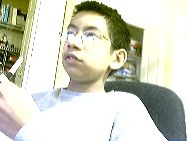
was this taken with a webcam? |
|
|
|
03/26/2005 08:16:57 PM |
|
composition is good, the high lights are blown, color balance is off. all affects image color and quality, appears shutter speed little slow........sorry about being critical, hoping to help.............3 |
|
|
|
03/26/2005 01:06:22 PM |
|
The idea is there, but the overexposure really detracts. Composition needed to shift left to avoid pulling the eye to the blank corner and to include the hand which is annoyingly cut off. |
|
|
|
03/26/2005 10:52:41 AM |
|
the classic blown out webcam shot |
|
|
|
03/26/2005 04:50:53 AM |
Unfortunatley, just not a quality image. It's overpixilated (probobly due to being resized in correctly....if you need help with that, private message me, and I can give you some advice.) Also, the lighting is very poor (I can help with that too.) and the picture is very blurry (This could also be a resault of resizing.) The only other thing is that your subject dosen't look bored. He actually sort of looks intersted.
Keep trying.
L8r, |
|
|
|
03/25/2005 08:02:15 PM |
|
Overexposed and it looks like the picture was originally blurred and you tried to sharpen it... it looks overly sharpened. Also, the boy is too far to the left... to much emply space to the right. |
|
|
|
03/25/2005 04:33:45 PM |
|
|
|
03/25/2005 04:37:48 AM |
The good:
1. You got the size right
The bad:
1. Harsh bright lighting blown out on the shirt, glasses and top right part of room.
2. Focus - the pen might be...
3. Noise - way too much noise all over this show |
|
|
|
03/24/2005 11:41:28 PM |
|
was this taken with a webcam or a cellphone? |
|
|
|
03/24/2005 06:05:16 PM |
|
|
|
03/24/2005 11:50:21 AM |
|
great composition. too bad the quality isn't better |
|
|
|
03/24/2005 10:57:09 AM |
|
This is way overexposed, grainy/noisy, and the subject and composition don't do a lot for me. |
|
|
|
03/23/2005 06:55:35 PM |
|
This photo is very overexposed and rather grainy |
|
|
|
03/23/2005 02:44:01 AM |
|
This photo is way over-exposed, and the glare from his glasses covers his eyes fairly well |
|
|
|
03/23/2005 12:53:52 AM |
its all to do with the eyes
|
|
|
|
03/23/2005 12:30:21 AM |
|
Home -
Challenges -
Community -
League -
Photos -
Cameras -
Lenses -
Learn -
Help -
Terms of Use -
Privacy -
Top ^
DPChallenge, and website content and design, Copyright © 2001-2026 Challenging Technologies, LLC.
All digital photo copyrights belong to the photographers and may not be used without permission.
Current Server Time: 06/30/2026 05:22:46 PM EDT.