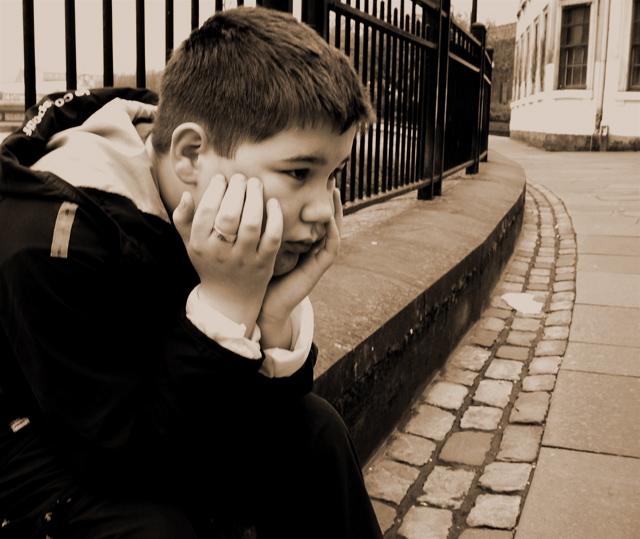
wow, really depicts boredom. The curves on the right lead your attention right to the boy, but those small white flecks of clothing in the lower left hand corner are a bit distracting. Other than that, i'd be surprised if this didn't finish top 10.
I only wish the boy's face was more in focus... it looks like the railing was focused on instead of him. But excellent tones and great choice to use sepia.
Ho hum...(in a good way). The expression is perfect! The bleak, yet graphically interesting environment works well to enhance your subject and theme. Wonder what this would look like in B&W. I'd like to see more detail in the clothes, though. With the few bright details in the bottom left corner, my eye wants to see some definition of fabric folds.







 Add photograph to your favorites
 Add photographer to your favorites


 Photographer found comment helpful.


