| Author | Thread |
Comments Made During the Challenge  |
|
|
03/04/2005 10:20:30 PM |
|
I was going to make some comment about an ice chest, but I don't think I can make it all that funny so I think I'll just skip it : ) |
|
 Photographer found comment helpful. Photographer found comment helpful. |
|
|
03/04/2005 08:34:06 PM |
|
You da man, Lee... you da man. :o) |
|
| Photographer found comment helpful. |
|
|
03/03/2005 03:25:23 PM |
|
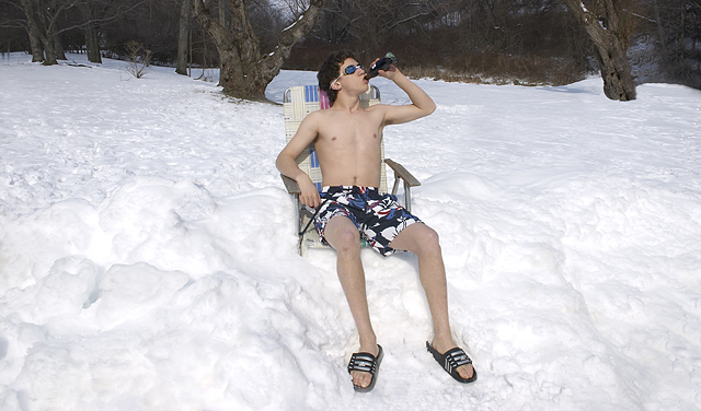
This is very cool (even cold, I should say). It would work much better, in my humble opinion, if the model were placed a bit more to the left, at the thirds' line. |
|
| Photographer found comment helpful. |
|
|
03/01/2005 07:58:09 PM |
|
| Photographer found comment helpful. |
|
|
03/01/2005 02:51:17 PM |
|
People looking at this billboard would have a hard time distinguishing that there is a bottle at all, let alone getting the trademark. Also, centered composition is not the best one in this case. Since you had natural white background, you could have created space for the text on either side by placing your subject near the edge. |
|
| Photographer found comment helpful. |
|
|
02/28/2005 10:09:59 PM |
|
Damn does that look cold! Its a nice idea, but try to put your subject in one of the thirds. a shot like this would definately have much more appeal that way. 6 |
|
| Photographer found comment helpful. |
|
|
02/28/2005 09:38:55 PM |
ok, i am voting this challenge in 2 passes. in this pass, you will get a partial comment and a score. then i will come back to comment again. if you have any problem whatsoever with this comment, pm me and let me know. otherwise, take it with a grain of salt...i'm not trying to be a know-it-all, i'm just explaining where i'm coming from in voting this challenge. and, if this comment is NOT helpful (of if you think i'm full of $#!+), don't mark it helpful.
billboards are a science unto themselves. a lot of research has gone into determining just how much information a person can digest and retain in specific time spans. they use this information to develop formulas for determining the number of words and letters to use on billboards, as well as their sizes. they also determine the size and number of visual elements to include.
the graphics/photograph on a billboard are designed to get the point across in a moment. on the road, a driver will have less time with a billboard than a voter will give your image. this is a key element in the challenge: composing a shot that will get its point across quickly and succintly. along those lines, a strong composition will probably have few details and make strong use of negative space.
-------------
nice idea, would have been stronger if the subject wasn't centered, and if the snow had at least a 6-pack (or more) of coke bottles sticking out. this also could have used a higher perspective, so that the bottle and head weren't lost in the background. i don't know how this will end up scoring, but it does show creativity, and if you harness it, you'll get where you want to be. good luck! |
|
| Photographer found comment helpful. |
|
|
02/28/2005 08:55:04 PM |
My hats off to the model -- I'm certainly not willing to go out in the snow like that :)
This ends up really busy with the trees and bushes. Eliminating those elements would have helped. |
|
| Photographer found comment helpful. |
|
|
02/28/2005 01:46:12 PM |
|
yeah, thats really awesome funny |
|
| Photographer found comment helpful. |
|
|
02/28/2005 01:31:26 PM |
|
|
|
02/28/2005 08:22:08 AM |
|
hahaha I just love it ! Nice thinking outside the box ! |
|
| Photographer found comment helpful. |
|
|
02/28/2005 06:14:12 AM |
|
Now THAT's dedication!! Crazy, but dedication... Product placement not clear enough though |
|
| Photographer found comment helpful. |
|
|
02/28/2005 02:05:03 AM |
|
dimentions should ahve been 640X320. Other than that...not a terrible image. |
|
Home -
Challenges -
Community -
League -
Photos -
Cameras -
Lenses -
Learn -
Help -
Terms of Use -
Privacy -
Top ^
DPChallenge, and website content and design, Copyright © 2001-2026 Challenging Technologies, LLC.
All digital photo copyrights belong to the photographers and may not be used without permission.
Current Server Time: 07/01/2026 09:19:33 PM EDT.