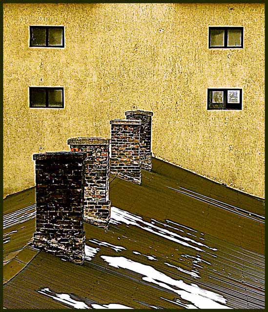
I LOVE this picture! Usually I do not favor over-unsharp-masked (forgive me if I'm wrong) pictures, this works very well stylisticly. And the compositions is WONDERFUL. The only thing, as has been pointed out, is the lack of an obvious correlation to the 70s. Keep up the good work.
I like the tones and surfaces in this image. I feel it is a little oversharpened, but this probably helps with to separate the tonal zones. - I do strugle a little on the 70's association.
Perhaps oversharpened but the composition is eye-grabbing and, consequently, earned a favorable rating from me. Did I miss something? How does this relate to the 70's?
I like this a lot. It is hurt by oversharpening, IMO, but I understand the metaphor and i commend you for entering this much-less-than-obvious take on the challenge. 8
A path not much travelled in this competition. I love the way the colors and textures of the roof, chimney, and walls play off each other. I love the rhythm created by all the repeated elements. The photo communicates age and speaks of an unadorned and utilitarian time.
One of the few shots that captures the bleakness of the 70s. I tend to think that colour was only invented in 1980 but maybe that's just poor memory. Good work
I'm giving you a 10 for not photographing a record album. Also.. for your use of yellows and browns. Nobody get's it when i explain that the 70's, as pictured in my brain, are yellow and brown. Pukish green too, but whatever.
I think this is a great photo. I don't know what the Rust Zone means or how this coorelates to the 70s. But I'm not going to vote you down simply because I may not know all my 70s trivia. I was only five when they were over. So I'm giving this a good benefit-of-the-doubt score.






 Add photograph to your favorites
 Add photographer to your favorites


 Photographer found comment helpful.


