| Author | Thread |
|
|
03/30/2003 11:15:38 PM |
Critique Club Comments by Grayce
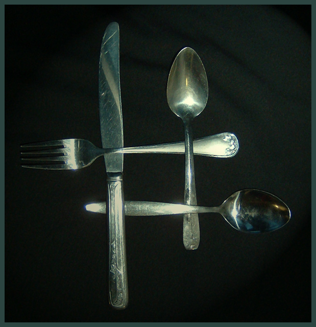
I love the simplicity of this image. Nice layout, good background too.
The depth of field is good with nice even focus. The background though a good choice should be wrinkle free. I've made the same mistake!!!
Perhaps a little more light would be good.
OVerall I like it, but it needs more attention to detail.
Regards,
Grayce |
|
Comments Made During the Challenge  |
|
|
03/18/2003 08:33:32 PM |
|
I think you need to be a little more nit-picky in your setup. There is a watermark in the bowl of the spoon and the fold in your background is distracting. |
|
 Photographer found comment helpful. Photographer found comment helpful. |
|
|
03/17/2003 11:35:40 PM |
I like the pattern that you've created here. Very original idea. I also like the pattern on the silverware.
Focus is quite good, and your subject matter meets the Challenge. |
|
| Photographer found comment helpful. |
|
|
03/17/2003 05:39:09 PM |
|
Needs much more light. Plus it's not a very interesting subject to begin with in my opinion. |
|
|
|
03/17/2003 11:44:09 AM |
|
dark? it may be me- several seem dark to me on this monitor |
|
|
|
03/17/2003 11:12:57 AM |
|
A little too dark, but the compostion and the idea is good. |
|
|
|
03/17/2003 09:42:40 AM |
|
|
|
03/17/2003 03:18:20 AM |
|
Good idea and the composition is interesting too. There is a little too much glare from the light/flash in the two spoons and at the end of the fork. |
|
| Photographer found comment helpful. |
Home -
Challenges -
Community -
League -
Photos -
Cameras -
Lenses -
Learn -
Help -
Terms of Use -
Privacy -
Top ^
DPChallenge, and website content and design, Copyright © 2001-2026 Challenging Technologies, LLC.
All digital photo copyrights belong to the photographers and may not be used without permission.
Current Server Time: 06/28/2026 11:27:13 AM EDT.