Author Thread
Post actions
Sorry just read your comments about neat image. Sometimes neat image will mess a photo up...more then it helps levels or curves will be better and not take all the details out.
Post actions
This is neat I like shots with subject floating:) Theres a strong blue here thats really popping... May have camera shake though or motion bedcause standing this close you should be able to read the words.Message edited by author 2005-02-12 14:28:05.
Comments Made During the Challenge
Post actions
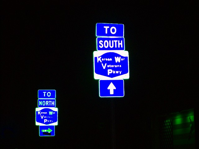
Nice isolation of your subjects! Green spot on the bottom right is a bit distracting though.
Post actions
Post actions
IMHO, this image is too saturated. But jus my opinion.
Post actions
It's interesting how the signs float in the image. Maybe a crop would help, to remove the green patch from the lower right.
Post actions
looks like as if its pasted.... nice...
Post actions
inside resources say north
Post actions
I feel like I need my glassed adjusted. A little blurry.
Post actions
Good subject matter but I find the quality rather annoying, and the uncertain green element in the bottom right is rather distracting
Post actions
where was this?? I like it...looks like the signs are floating!






 Add photograph to your favorites
 Add photographer to your favorites

 Photographer found comment helpful.


