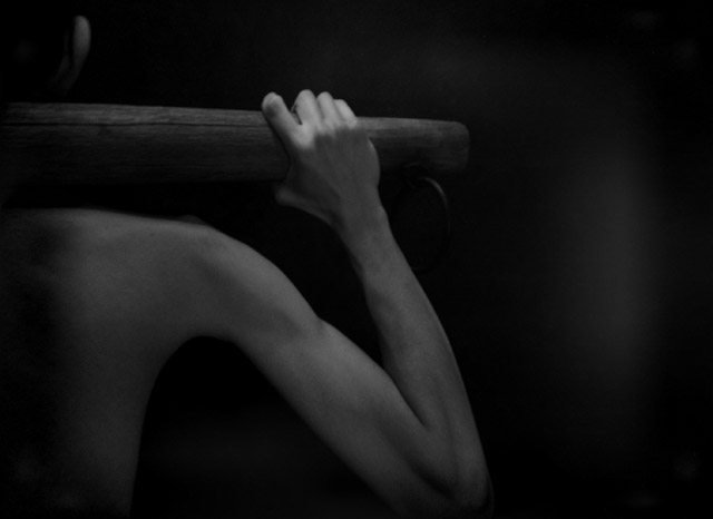
YEAH...it worked! This is the shot idea wanted to get in and it worked, i have been able too pull my filler shot and am happy since it was not a great idea or shot in fact it was an axident...lol
but on too this shot.....(please put your wide angle lense on when viewing the bicept....lol)
ok but really, i don't have any money and when i get some it is spent on equipment or equipment....so i have no $ to use to higher a model.....
so i was a timer that took the shot and not my finger with that said yes it is my non atractive string-bean are in the image.. :^O
here's what i did-
-lighting-
Set up all the lights in my room so that the place was dark, i even covered the pulsating LED on my sleeping Mac. G4 laptop.
then i took 2 lights i set 1 up indriectly pointed at a fill card, the other hung from a beam and shown through a mesh laundry hamper (to use as a diffuser).
-post editing-
In PS i converted it to the grayscale, adjusted; Curves, Brightness&Contrast.
then
i clonedout some small dust specks on my black backround cloth
and applied the filter that creats the image u see.
(i believe it is leagle since it does not move any pixels)
It is a plug-in download i found on the web called- "Make ISO Cube Tile"
basicly a cube tile affect that birghtens the cubs acording to the light and dark spots of the grayscale.
(or that is what i understand it to do)
i resampled it to 640width
and submitted
thanx for all the comments and votes
.....and please look at the arm through your wide angle it look beefy and strong that way....naw i'm just kidding.....but if the girls would like to use their wide............
ok thats all
Statistics
Place: 172 out of 266 Avg (all users): 5.0905 Avg (commenters): 6.8333 Avg (participants): 5.0084 Avg (non-participants): 5.1863 Views since voting: 986 Views during voting: 309 Votes: 221 Comments: 7 Favorites: 0
I don't like the burning of the edges for this image. I'm usually a fan of the technique but in this case I feel like it's cutting off important information that is on the side. Nevertheless, one of my favorite images in the challenge. 9
Nice light on the subjects hand. The burned or shadow section under the arm makes your subject look skeletal. It does not align with the muscle definition on the upper side of the arm.







 Add photograph to your favorites
 Add photographer to your favorites


 Photographer found comment helpful.


