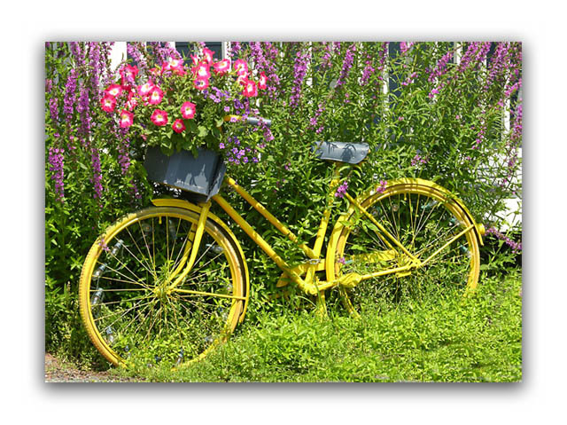
what a fun image! however, i can only imagine the comments you are getting...
while the border can be handled as a cosmetic, the bigger issue, for me, anyway, is the time of day you shot this. yes, you want the yellow to pop, but you also don't want all the greenery to be too washed out. there is a subtle difference between washing out and vibrant saturization. oh well, this is just my opinion. you have a fine image, and i'm sure it would look good hanging on a kitchen wall. good luck with this, and all the challenges yet to come!
Nice shot but the contrast is just to overpowering. I find it to be to bright. I'm also not fussy on the border because in my opinion its to big. Good luck and keep up the good work in 2005.
The 3-D frame is cool, but the picture is good enough to be with an ordinary frame (or no frame). Actually, to more I look at it, the more I like it. Please describe after the vote how you did the frame. 8
I like the colors here, and how you filled the frame. I am NOT a big fan of the elaborate framing you did of the photo, although the photos seems to pop off the page... I want to judge on the photo itself and not on the presentation (but that is just me). Just a couple of ideas that might be fun to play around with here... playing a little with saturation levels might be fun, making the bike really POP out of the leaves, or bringing out the magentas and reds in the flowers, maybe trying a desat of the green? This is a photo that you could probably play around with to get something a little more artsy and less of a well composed snapshot.
The border is distracting and seems like a waste of pixels when you only get 640 to work with. It's a nice scene, but I'd like to see the bike stand out a bit more from the greenery. The bike seems a little green and the plants a little yellow. Play with the color balance a bit and see if you can separate them.
Lighting is harsh. Interesting bike though. I wonder if this would work better in b&w? The border is wide for this image. A nice thin, simple border is best, imo.
IMO, the yellow of the bike tend to blend into the green of the grass too much. The lighting is good and the composition is OK, but it just doesn't jump out at me, even though your border trys to accomplish this.






 Add photograph to your favorites
 Add photographer to your favorites


 Photographer found comment helpful.


