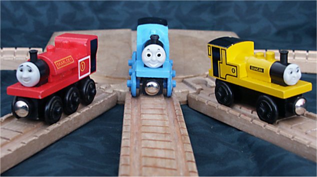
This is a cute photo, one that brings back memories of when I used to watch the show on TV. As for the photo, I think much has already been said. There is an overall soft feel to the focus. Your aperture was 3.5, which seems to be a tad too shallow. The higher iso might have also led to the softer feel. I personally don't like the cloth pattern background. I think it takes away a lot from the photo. Having a solid color would have helped the viewer focus on the middle train much easier. The lines are good, I think they would be improved by taking more of a track level perspective shot. Did you consider trying to just focus on the middle train and crop out or leave out the other trains all together? I think that would make an interesting photo. And it would do a better job of simulating actual railroad track, if that's what your intent was. Anyway, not a bad photo, but one that could be easily improved to make it even better. Good luck in the future.
Josh
Good idea, but seems very blurry overall. Also, the leading lines don't point at /one/ object. I think the image would have beena lot stronger ifyou had had only one train on the round thingie. (4)
A simple and effective composition. The colour seemed a good addition to the shot. I was wondering if the photograph would be improved by having everything in sharp focus. I didn't think that the chosen depth of field helped in any way. Good idea though.






 Add photograph to your favorites
 Add photographer to your favorites


 Photographer found comment helpful.


