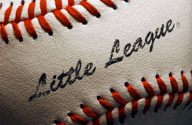
Nice. Only suggestion I can make is that a new ball would have been slightly better, although the worn look isn't at all bad.
Great composition & lighting, and the amount of detail is fantastic. Well done.
With the "Little League" logo in the picture it narrows the field of prospective customers. The nice close up of the baseball is winderfull and very saleable. 7
I like the composition here with the red stiching in the upper left and lower right corners. For inclusion in a stock portfolio, I would also have a similar shot without the logo in order to give the shot a broader market appeal. Exposure is good, the lighting over the contour of the ball helps to show that it's a three dimensional object, and your focus is quite good.
Really like the stitches on this, they give your composition a lot of Umph. I could definitely see this in a brochure, on a coach's wall, etc., challenge is well met.






 Add photograph to your favorites
 Add photographer to your favorites


 Photographer found comment helpful.


