This photo has a lot going for it and I think only one tiny drawback. I'll try to break things down here.
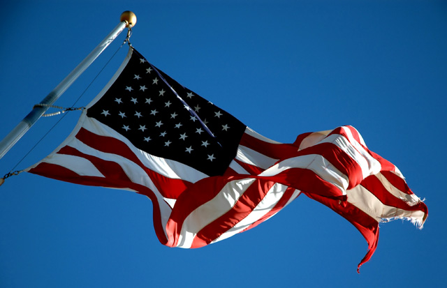
Focus: Good overall focus and depth of field. I especially like the detail of the frayed fabric of the tear in the flag.
Composition: I really like the composition with just the sky in the background. The vibrant blue looks great and doesn't introduce any background distractions. I like the diagonal fit of the flag with just enough of the pole included.
Lighting: The lighting is my favorite part of this shot. I think the bright light brings out great shadows across the rippling fabric. I think that diffuse and even lighting would detract a lot from the definition provided by the shadows. The colors here are absolutely supurb. My only tiny problem with the shot, which can't be helped much using the "basic editing" rules of this challenge, is the dark top left corner. I wouldn't want to cut out much of the pole if at all possible, but I think maybe cropping off just 1cm on the left side of the shot wouldn't detract much, but would get rid of most of the dark corner. (I know... isn't that a petty thing to notice?... but hey, I don't see much else to pick on ;-) )
Overall: This is one of the very top flag shots because of the amazing colors, great composition (without a distracting background) and sharp shadows caused by the hard lighting. Good job!
Well, after careful consideration of all the flag photos, I will give you the Pulitzer prize for Best Flag in Inconsequential Photojournalism. Well done.
great angle - interesting tear. for the type of image that is normally conveyed here (ie: strong, bold, beautiful - especially considering the angle), a flag that wasn't ripped might've been better. obviously, that's not so much in your control ;). great job.




 Add photograph to your favorites
 Add photographer to your favorites


 Photographer found comment helpful.


