| Author | Thread |
|
|
11/18/2021 08:07:52 AM |
Congrats top 10 and a 10 from me.
Your work is outstanding. |
|
 Photographer found comment helpful. Photographer found comment helpful. |
Comments Made During the Challenge  |
|
|
11/15/2021 07:29:30 PM |
|
| Photographer found comment helpful. |
|
|
11/15/2021 09:25:39 AM |
|
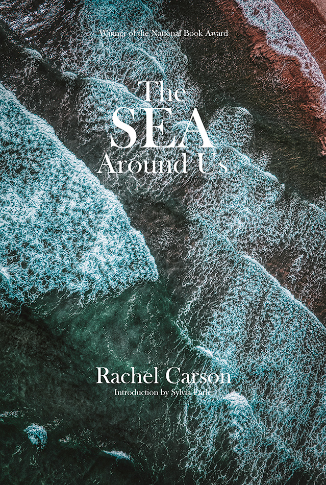
I love the image. Design-wise, it would have made more sense to go with less conventional use of the type - White type over dark parts of the image to make it more readbable. |
|
| Photographer found comment helpful. |
|
|
11/13/2021 08:12:28 PM |
|
| Photographer found comment helpful. |
|
|
11/11/2021 02:55:08 PM |
|
Very nice. My highest score given. However, as a graphic designer I see that you didn't kern the text. Don't be alarmed, no one knows about kerning. It is adjusting the space between each letter (in the word "Us" the space between the u and is a bit wide for example). Computers can't do it so you have to do it "by hand". Its not as easy in PS as in a graphic design but it can be done. After the challenge ends, I can tell you more if you want. Learn to kern and it will be perfection! |
|
| Photographer found comment helpful. |
|
|
11/11/2021 08:13:40 AM |
|
Very nice, good luck this is a very good cover in a very competitive challenge. |
|
| Photographer found comment helpful. |
Home -
Challenges -
Community -
League -
Photos -
Cameras -
Lenses -
Learn -
Help -
Terms of Use -
Privacy -
Top ^
DPChallenge, and website content and design, Copyright © 2001-2026 Challenging Technologies, LLC.
All digital photo copyrights belong to the photographers and may not be used without permission.
Current Server Time: 06/28/2026 02:23:28 AM EDT.