| Author | Thread |
Comments Made During the Challenge  |
|
|
12/05/2004 12:41:56 PM |
|
Too bad I would love to have a couple to store all my slides ;-). Good work. |
|
 Photographer found comment helpful. Photographer found comment helpful. |
|
|
12/04/2004 06:10:15 AM |
|
Its pretty interesting B&W... i like effect of overexposure. |
|
| Photographer found comment helpful. |
|
|
12/03/2004 07:17:23 PM |
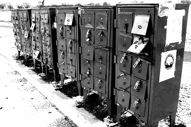
A good photo with a rather lame title. Junkmail would imho have been much better.
I like the balance betwen the snow, sky and the dark boxes. -7 |
|
| Photographer found comment helpful. |
|
|
12/03/2004 01:02:13 PM |
|
I like the color (or lack there of) choice and the fact that I keep looking at it to see other stuff like the locks and papers, etc. GJ. |
|
| Photographer found comment helpful. |
|
|
12/01/2004 03:03:18 PM |
|
I like the background of this photo the snowy background. But it creates a cold feeling, like the older days feeling. |
|
| Photographer found comment helpful. |
|
|
12/01/2004 02:56:40 PM |
Huh? it appears that there are several that are opened. Too many mailboxes.
Too much contrast here, loss of tonal range. I think you might have done this as an artistic gesture. If you have, then it doesn't do it for me. If this was not your intention, I can suggest that you be more careful to preserve the tonal range. The tonal range can be obliterated by aggressively narrowing the levels, or increasing the contrast and brightness too much. |
|
| Photographer found comment helpful. |
|
|
12/01/2004 11:00:35 AM |
|
nice B&W good contrast with the boxes and the snow. |
|
| Photographer found comment helpful. |
|
|
12/01/2004 02:40:54 AM |
|
cool. i actually like the posterisation effect here. the severe contrast really boils down the subject. |
|
| Photographer found comment helpful. |
Home -
Challenges -
Community -
League -
Photos -
Cameras -
Lenses -
Learn -
Help -
Terms of Use -
Privacy -
Top ^
DPChallenge, and website content and design, Copyright © 2001-2026 Challenging Technologies, LLC.
All digital photo copyrights belong to the photographers and may not be used without permission.
Current Server Time: 06/28/2026 08:30:22 PM EDT.