I like that very much, was one of my top 10 votes.
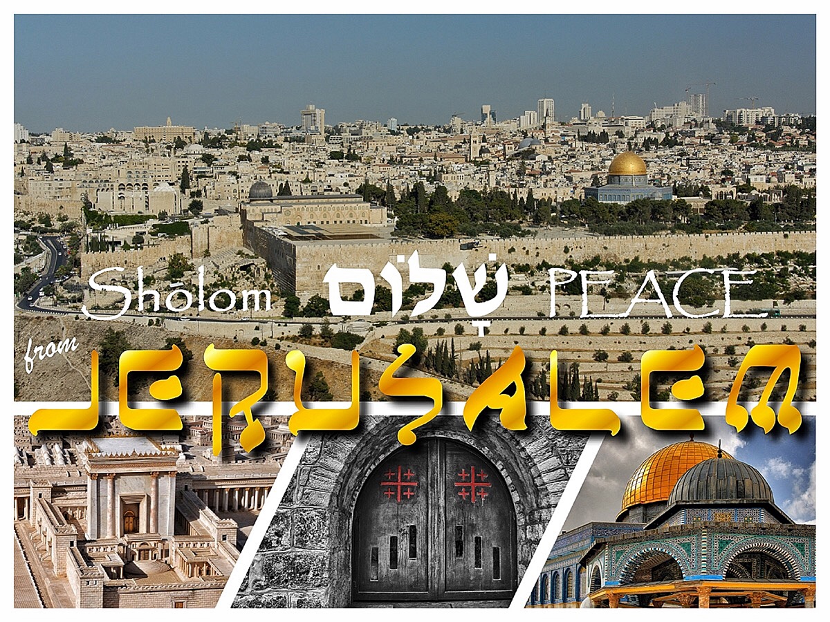
For me the combination/layout of all 4 pictures is typical for a postcard.
I love that you chose matching fonts, although the top one isn't legible very well since the bg is too busy
Nicely done, credible as a postcard. The 3 details at the bottom make this, otherwise it would have been pretty boring except for the golden dome. (which is however not uncommon for a postcard)





 Add photograph to your favorites
 Add photographer to your favorites


 Photographer found comment helpful.
