| Photograph Information |
Photographer's Comments |
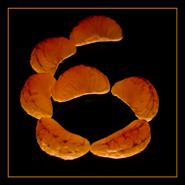
Challenge: Lucky 7 (Basic Editing I)
Camera: Canon Digital IXUS 400
Location: My bedroom, Bascharage, G-D of Luxembourg
Date: Nov 29, 2004
Aperture: F/4,5
ISO: 50
Shutter: 1/6 sec
Galleries: Still Life, Food and Drink
Date Uploaded: Nov 29, 2004
|
Idea:
The idea to this came rather spontaneously. Frankly, I was eating a tangerine. I was bored. I held
it under my desk lamp and liked the look of the light shining through and the details it created.
(By the way, lamp-roasted tangerine tastes awful.) Now I took 7 of the fruit's 'toes' and thus
fulfilled the challenge requirements. Then I arranged them to form a 6 to create some controversy. I
wonder if anybody will comment the picture for challenge misinterpretation ;).
Setup:
I cleaned a glass surface (missed some dust though), put it onto two chairs to get it away from the
floor (DOF is hard to get right with an IXUS), which was originally meant to give it a blurry blue
background, but I decided for pure black later. I placed my desk lamp at various angles underneath
the tripod to get a good balance between backlighting and reflections in the glass. That's it.
Post Processing:
Square crop,
brightness/contrast to get the background pure black and the orange more vivid,
hue/saturation to get more vibrant colours,
curves to minimise reflections and emphasize dark details inside and on the 'toes',
orange border,
resize to 640x640,
sharpen.
Comments: I clearly missed some dust which I'd have liked to clone away.
I didn't know how to get rid of all of those reflections below the 'toes'. |
| Author | Thread |
|
|
12/14/2004 04:15:28 PM |
Thanks for all your constructive comments!
Most of you mentioned the border. If I had the choice now, I'd still put in in, but with only half its width.
Originally posted by Artan: 'My only concern is that the lighting makes the orange segments look a little dried out.' - Guess what: they actually were. I learned that tangerines don't look fresh for a long time. The strong light did the rest to dry it out. I thought about adding some drops but then dismissed that idea again.
Originally posted by Rankles:'(Although that's not quite and oxmoron :p)' - Yeah, I know. My English teacher would choke me for this :) But Irorange or Paradorange sounded silly. Artan also suggested 6's and 7's. |
|
Comments Made During the Challenge  |
|
|
12/06/2004 03:41:02 AM |
Nice image 6's and 7's woild also be a good name here.
Great impact my only concern is that the lighting makes the orange segments look a little dried out. |
|
 Photographer found comment helpful. Photographer found comment helpful. |
|
|
12/05/2004 01:26:01 PM |
|
|
|
12/05/2004 03:41:57 AM |
|
I love how the lighting gives the oranges a translucent quality and that you shaped them in a number other than 7. Picture seems a little over-processed. |
|
| Photographer found comment helpful. |
|
|
12/04/2004 10:47:55 AM |
|
Really like how you play with words and oranges, my lucky 7 |
|
| Photographer found comment helpful. |
|
|
12/03/2004 08:23:20 PM |
|
Stunning! Brilliant. Simple, understated and superb. |
|
| Photographer found comment helpful. |
|
|
12/03/2004 02:38:47 PM |
|
but their in the shape of a 6? Like the contrasting colors, the lighting and the frame. |
|
| Photographer found comment helpful. |
|
|
12/01/2004 11:34:01 PM |
|
Good title, good comp. Seven orange slices to spell out six. Clever. Border is a bit much, but not bad. Good texture on the fruit, nice choice of background. You did good pal. (8) |
|
| Photographer found comment helpful. |
|
|
12/01/2004 10:39:48 PM |
|
Focus seems generally soft in this shot. I like it.. nice colors. I like the orange on black. I'm not sure the border helps at all, but oh well. Definately a creative take on the challenge. interesting choice of subject and nice layout. ~Heather~ |
|
| Photographer found comment helpful. |
|
|
12/01/2004 02:14:30 PM |
|
A brilliant capture with an excellent title to match. Good composition and use of light. A very imaginative and creative idea. Border works well too. My fave for this challenge. Good luck. |
|
| Photographer found comment helpful. |
|
|
12/01/2004 01:01:00 PM |
|
Great colors and concept but a bit tighter focus and highlights would have helped alot. great effort, just missed the mark. |
|
| Photographer found comment helpful. |
|
|
12/01/2004 11:39:28 AM |
|
Just plain funny all the way aroujnd...you have quite an imagination and the photography is really good. In my opinion the border is way too large and detracts from the composition. I think this one will do very well just on creativity alone....is it my imagination or does it need to be sharpened a bit? |
|
| Photographer found comment helpful. |
|
|
12/01/2004 06:25:04 AM |
|
Very clever! Excellent shot! (Although that's not quite and oxmoron :p) |
|
| Photographer found comment helpful. |
|
|
12/01/2004 03:38:27 AM |
|
|
|
12/01/2004 03:34:53 AM |
|
Cute name... There is something annoying about this, yet compelling to keep looking to work it out... |
|
| Photographer found comment helpful. |
|
|
12/01/2004 01:12:40 AM |
|
This made me smile. Nice job. I'm not generally a fan of borders but this is a good one. Hope it does well. |
|
| Photographer found comment helpful. |
|
|
12/01/2004 12:22:56 AM |
|
One of the very few cases I've seen where the border adds to the image. Nice. |
|
| Photographer found comment helpful. |
|
|
12/01/2004 12:13:20 AM |
|
Nice. I usually don't like borders, but it works here. I especially like the lighting and the mottled look it gives the segments. |
|
| Photographer found comment helpful. |
Home -
Challenges -
Community -
League -
Photos -
Cameras -
Lenses -
Learn -
Help -
Terms of Use -
Privacy -
Top ^
DPChallenge, and website content and design, Copyright © 2001-2026 Challenging Technologies, LLC.
All digital photo copyrights belong to the photographers and may not be used without permission.
Current Server Time: 06/29/2026 05:34:12 AM EDT.