| Author | Thread |
Comments Made During the Challenge  |
|
|
12/07/2004 11:00:52 AM |
|
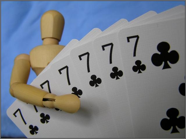
I am not one of the woody-haters. In fact, my humor entry used one. However, I think the lighting in the photo leaves this woody a little flat. Great focus and dof. Good natural colors. The wrinkled area above Woody's head to the left is a little distracting. These are the kinds of comments I wish someone would leave for me, so I hope you find them helpful :) |
|
|
|
12/07/2004 07:31:46 AM |
|
Interesting idea, though I think I would like it more if the depth of field extended to include the body and head of woody. Good texture on the cards though. |
|
|
|
12/04/2004 11:13:15 AM |
|
|
|
12/03/2004 11:13:53 PM |
|
Very nice shot. Not quite sure the purpose of the little man, but he does help to add something interesting to the shot as well...it's now not JUST a photo of some cards. The background is very nice, I like the blue. Focus and clarity are really great on the cards, and DOF is good as well. I think that I do like this shot, my only tiny nitpic is the black line across the bottom of the photo in the lower left hand corner. Kind of a distraction in an otherwise bright and fun photo. Good luck in the challenge. ~Heather~ |
|
|
|
12/02/2004 09:02:36 AM |
|
Lol. Nice perspective, like your choice of blue background. Good luck. |
|
|
|
12/01/2004 10:29:44 AM |
|
nice comp and colors, like the way the lines of the shot make my eye move around the image. |
|
|
|
12/01/2004 09:19:17 AM |
|
I love any photo with woody! I think Woody is a little out of focus. 8 |
|
|
|
12/01/2004 08:12:11 AM |
|
Another one of those creepy little wooden guys. I have been seeing alot of them lately. Nicely done. A little fuzzy focus on the head of the guy though. You get an 'A' for effort (going through 7 decks of cards) |
|
|
|
12/01/2004 04:30:32 AM |
|
very good composition but i feel technicaly it is a little bit dark. |
|
 Photographer found comment helpful. Photographer found comment helpful. |
|
|
12/01/2004 02:56:19 AM |
Could use a tad more DOF - woody's head is not sharp enough.
Also, a bit hazy - try USM 30-40%, 60 radius and t-hold of 1. |
|
|
|
12/01/2004 12:28:28 AM |
|
Woody wins the Celebrety Poker Showdown! The cards are nicely focused. The photo would be better without the folds (or shadows) in the background, IMO. |
|
Home -
Challenges -
Community -
League -
Photos -
Cameras -
Lenses -
Learn -
Help -
Terms of Use -
Privacy -
Top ^
DPChallenge, and website content and design, Copyright © 2001-2026 Challenging Technologies, LLC.
All digital photo copyrights belong to the photographers and may not be used without permission.
Current Server Time: 06/28/2026 01:39:26 PM EDT.