| Author | Thread |
Comments Made During the Challenge  |
|
|
11/30/2004 10:37:05 PM |
returning for comment:
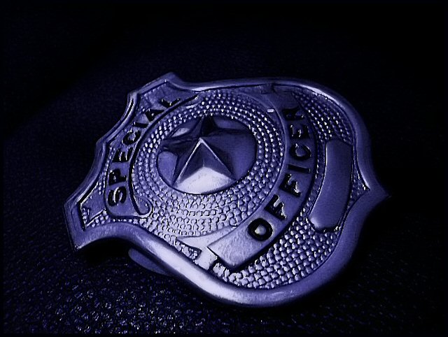
Very good job, here. the lighting can not be improved. Bumping up to 7 on great impression. |
|
 Photographer found comment helpful. Photographer found comment helpful. |
|
|
11/28/2004 11:44:02 AM |
|
I like this image. Nice use of lighting and color. I would like to have seen a more creative cropping/framing, but the angle is creative and aligns with the star in the center of the badge so it does work. |
|
| Photographer found comment helpful. |
|
|
11/28/2004 05:01:24 AM |
Somewhat subdued, but probably as an artistic gesture, which is okay.
Sharp, in focus. I'm not sure the perspective works here. I think I would have shot it at a different angle. Overall a good entry.
|
|
| Photographer found comment helpful. |
|
|
11/26/2004 05:09:45 AM |
while i can get what you're shooting for, i think the execution could be a little stronger. if you had rotated the badge another 10-15 cw, leaving the lighting the same, i think it would be much more dynamic. as is, it looks like a badge, laying on its side.
[not that it matters to me from a voting standpoint, i think the title could use a little work as well.] |
|
| Photographer found comment helpful. |
|
|
11/25/2004 08:54:53 AM |
|
Very nice. Love the lighting and composition. I like the subtle dark blue tint on the badge. |
|
| Photographer found comment helpful. |
|
|
11/24/2004 10:33:11 PM |
|
| Photographer found comment helpful. |
|
|
11/24/2004 12:17:14 AM |
|
The angel of presentation makes this difficult to read. I like the tone, but the incomplete isolation is distracting. There are a few spots where the reflection from the light may be a bit too harsh, perhaps a more diffuse source. |
|
Home -
Challenges -
Community -
League -
Photos -
Cameras -
Lenses -
Learn -
Help -
Terms of Use -
Privacy -
Top ^
DPChallenge, and website content and design, Copyright © 2001-2026 Challenging Technologies, LLC.
All digital photo copyrights belong to the photographers and may not be used without permission.
Current Server Time: 06/29/2026 03:47:26 AM EDT.