returning for comments;
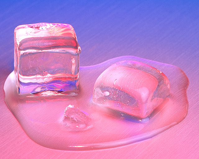
A nice capture, yet I would have prefered its natural state as the effects remove the liquid feel somewhat. Bumping up to 6 on great comp.
This is just too sweet! I love the colors and the angle of the lines in the surface below. The crop feels unbalanced, to me...perhaps a little more inclusion on the left or a different angle to crop the right. Lighting is expertly handled in what could not be an easy shot.
Neat, careful, good use of colour. Taking the colour so very far away from black I think works to give the image that neon punch, though the obvious downside of it is to stifle any strong sense of depth. Not sure about it, in the end.
Another simple idea that is well executed. Why can't I come up with these? I like the soft color instead of the cold blue you would expect. Adds to the impression of the melting. Good job.
Nice concept and I like the use of color from cool blue in the background to warm red in the foreground. I also feel movement in the lines underneath the melting ice. It gives the feeling of the image sliding off the edge of the photo. The artist's placement of the focal point in the lower left edge of the frame adds to the illusion of movement. All his or her efforts work well to create an overall succes in this image. Nicely done.
Damn.. this is almost exactly what I was trying to accomplish but couldn't. (I didn't have color though). I'd love to know what you used for a surface/background.
I particularly like the surface. Not sure about the colors, but as this is only my personal problem, wouldn't downgrade for colors.
Nice focus and idea, 7







 Add photograph to your favorites
 Add photographer to your favorites

 Photographer found comment helpful.


