Author Thread Comments Made During the Challenge
Post actions
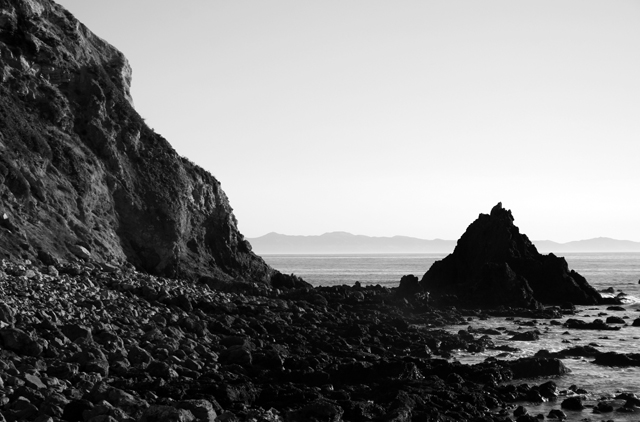
This image, while interesting, I thin kwould do better as a color image. There doesn't seem to be strong enough lighting to retain even texture through the foreground rocks, and there isn't much contrast between the design elements. The addition of color, while excluding this image from this challenge, would help to add that much needed contrast.
Post actions
Ahh, the Goonies...this is a nice shot, but the darkness is a bit high for me so some of the rocks blend together.
Post actions
I LOVE "The Goonies" Reference in the title!
Post actions
Post actions
ha! i love the goonies! 10 for you!
Post actions
i came back to this one, not bad at all.
Post actions
Is this the actually location of the Goonies movie?
Post actions
3 bonus points for the "goonies" reference!
Post actions
Great horizon, just a bit too dark in the foreground.
Post actions
Post actions
I love the Goonie reference!
Post actions
I like it, but I feel like there could be more to it. Maybe Willie's ship in the center or more detail in the rock pyramid.
Post actions
IMO contrast is too high to see the beauty of the scene.





 Add photograph to your favorites
 Add photographer to your favorites


 Photographer found comment helpful.


