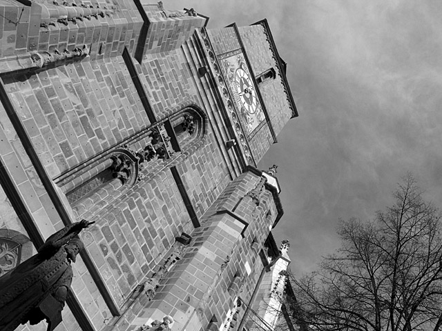
Creative use of perspective makes this image stand out from being "just another building". Great exposure as well. Not too bright, not too dull. I think use of b/w works very well in thie image by drawing attention to the brickwork and the silhouette of th bare-branched tree.
i don't mind a picture being askew somewhat, but i'd say you've gone a little overboard for my tastes. that aside, it's a nice perspective on the building, and i like the inclusion of the clouds (not the trees so much, but what can ya do?) Too bad it's basic editing and you can't burn the clouds some....that contrast would be fabulous i think.
nice shot.
Very detailed structure, in clear focus. Great in b&w. I like that. I just don't like the radical tilt of this photo. Just my opinion. I know you composed it like this on purpose for impact. Not a slightly leaning building you didn't straighten. The longer I look at it the better I like it, will up your score.




 Add photograph to your favorites
 Add photographer to your favorites


 Photographer found comment helpful.


