Challenge link: weak. Possibly missed the point of the challenge - there's no impressionism here.
Image critique: very pretty little shot with nice detail. Background is distracting though due to the dark mark which is very prominent. Good composition otherwise.
Out-of-challenge appeal: OK - but not much to come back for really.
This is in my opinion a very good photo the perfectly fits the challenge.
To me impressionnism is about depicting light and colors. In photography (related to impressionism), I think that we should not try to give a "painting effect" but rather focus on transmitting impressions regarding light/colors.
note: I'd love to see a tutorial on how to achieve such results
The soft focus is quite suitable, switching the emphasis to light/color even more.
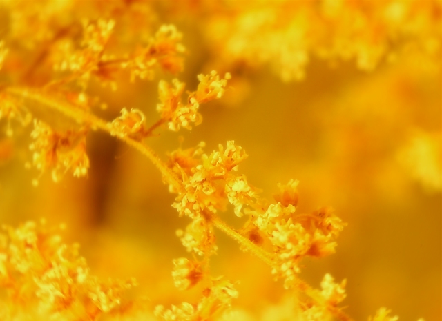
I guessing this was a powerful yellow filter or a Photshop RAW tweak all the way to the left. Regardless I like the lines and the opposite corners upperR/lowerL and the balance is great. With all the emphasis on blur/fade/scratch technique in the rest of this challenge I actually found myself wishing that the upper-center branch was more in focus. High Marks
Very attractive, simple and effective. I like the way the subject blends into the backround and yet is dominent enough to maintain the viewers attention.
the color cast here is a little too much in-your-face for me to find enjoyable. maybe if it had been muted a little, so as to let the branch stand out?
Lovely rich autumn colours, I wish the composition was a bit more clean and striking... it's just a tad too homogenous for my taste. Great use of dof. 7
This si very lovely to me. I like the lacey flowers, and the gold tones look natural to little ol' colorblind me. The composition is also quite effective with that twig coming in from upper left and leaving lower right. 8
Returning for comment.
A soft yet vibrant shot, I can see focus and detail amonst the golden haze. This is my pick for this challenge. A great shot in a difficult challenge, well done.





 Add photograph to your favorites
 Add photographer to your favorites


