Greetings from the critique club:
This could be a very nice picture. I don’t know if you visited this on a trip, or if you can revisit it, but if you can I would highly recommend you try again. It could be a good study. I do this often when I feel that a picture could be better. You are on the right track, and with a little tweaking you could make a very nice pic out of this.
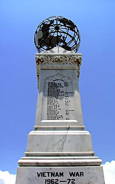
Composition:
I would revisit a study of the rule of thirds. This is right up the middle of the capture, and that usually doesn’t create a sense of dynamics, especially in architecture, or monuments like this. I would have have moved to the right about 30 degrees and had the monument itself take up the right 1/3rd of the capture. That would get you a feeling of size and shape.
Lighting:
I like your sky a lot. The stark blue adds a nice contrast to the stone. This particular pic would have been a little better had it been taken during the “magic hour”, The time just before sunset, or just after sunrise. This would make much longer, almost horizontal shadows come across the monument. As it stands, the stone looks a little flat with that mid-day sun.
Post processing:
This is the point that you can still fix. It is hard for me to tell exactly what you did to the words on the monument almost unreadable. I would guess either neat image or over sharpening, or both. I like Neat Image, but I do think that it can be easy to overdo it. I have done it myself a time or two. Just take a good look at your post processing and think that for the most part, you want it to be subtle. I make it practice of doing my post, then I click on the original pic, to make sure it looks better in the end. Sometimes doing that makes you realize something else that can be done, or something that has gone too far.
I looked at your profile, and I think you have some stunning pictures. This one just missed the mark a little. You have a good eye, just remember your basics and you will get some great captures.
drake |