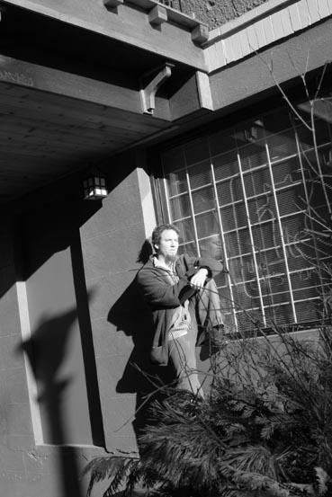
I might've cropped in closer on the subject to capture more of his shadow and reflection in the window and eliminate the lamp shadow and balcony above.
I like the shadow of the lampost and the white lines of the bars against the darker window, but the face of the model is a bit washed out by the light source. It is the only thing that disappoints me here. Otherwise...nice! One more think...I would have cropped out the roof. It changes where my eyes are drawn completely. I am viewing the picture now with the image cust off just above the models head. It is find this way for me....add that roof, it gets a bit busy!
like the shape of this one but the lamp post shadow and the twigs running over the man make it a bit confusin, but i really do enjoy the angle and textures used





 Add photograph to your favorites
 Add photographer to your favorites


 Photographer found comment helpful.


