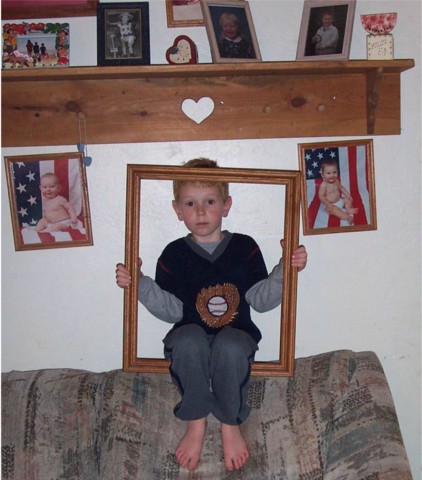
Composition - Too much sofa. The picture is also not true to the horizon. It could use about a 1-2 degree tilt Clockwise. Probably 2. The idea is good, but it wasn't executed particularly well. I like cute stuff, I have 3 kids of my own, but I don't see a lot of potential or alternate ways to go to make this a way better pic. It looks like a picture taken with flash or something making the area around the kid very very bright relative to the rest of the wall. The "framing" no pun intended, is not particularly good. With him dead center of the other pics, and dead center in the pic, its a dead ringer for a "too centered" tag. I think the best way around this is not taking the picture from dead on, but at a bit of an angle. That also might have saved you some of the flash reflection or other light reflection on the wall. This pic is too snapshotty to do well on DPC.
Technical - This pic is not particularly clear. The bright part right around the kid is not good. A much softer light source would have been preferred with a little less exposure. This pic could've used a little post processing sharpening to help it seem a little clearer. The biggest strike against it though is that it was not taken particularly sharp.
Overall - In my opinion, this is a little humorous, a little cute, and belongs in your family album. Nothing against kid pics out of me either, just this one was not particularly well done starting from the general composition. The portrayal of this idea, though I do think it is a good idea, seems pretty difficult to adequately replicate on "film." Hope I didn't ruffle any feathers, but this is what I think one way or the other. GOod luck in future challenges! - Inspzil
What a good idea...I have a big empty frame lying around...I think you could crop at around the knees and tighten things up a bit -- I don't think the bottom part adds that much. If he'd been sitting 6 inches higher it would then allow a landscape crop with all the important elements still in there.Moving a bit to the right to reduce the apparent slant of the shelf would make it easier to crop too.
Cute idea. His whole head needs to be in the frame. Brighten, not lighten, it up some. Don't take me wrong, but it has a snap shot fee; to it. Nice memorabilia and all, but belongs in a family album. But maybe that is really what a "cliche" shot is. Love the baby photos hanging on the wall. The shelf is a bit cluttered. Cute picture.
did you try to shoot just his face in the frame? I don't like the couch or being able to see the other things on the wall. You should also try not to use your flash on your camera. You can buy a lights at hardware stores that could help you out. I do like the pictures of the babies on the wall. What a good idea for a portrait. Good luck. :)
nice idea for subject but you could have done more to "clean up" the composition. it looks a little too haphazard for its own sake... unless haphazardness and "candid" are the clichés you intended to work with.





 Add photograph to your favorites
 Add photographer to your favorites


 Photographer found comment helpful.


