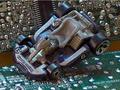
- A bigger depth of field would have kept the tops of your "buildings" in focus. The entire "city" itself seems a tad bit out of focus, but that could be due to resizing, handheld camera, or even my screen. The base may be just fine on your screen in your imaging software.
- Removal of the sticker would have helped people to see the "city" better. I would like to compare a color version to see which really shows off the city idea better.
- The lighting in this picture creates really harsh shadows. A second light or bouncing light in from the bottom left would help to reduce those.
- There are two blank spaces (top left and bottom right) that are distracting and could have been cropped out.
Good histogram spread from pure black through to pure ehite.
One thing I think would have improved the balance would be to have cropped top and bottom. That would have chopped out the small white wedges top left - bottom right






 Add photograph to your favorites
 Add photographer to your favorites

 Photographer found comment helpful.


