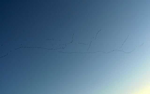
I really like this image, but I would have preffered it without the bright patch at bottom right. Also, I don't think that a website is the place this one should be on. It needs to printed large and displayed on a wall.
What a flock! They are not a very strong element in this compostion and the brightness of the lower right is pretty overpowering so I probably wouldn't want it on a calendar. Never the less, I enjoyed looking at it. 6
Interesting idea but doesn`t quite work as a calender photo. I think if you had zoomed in closer or cropped tighter to make them look like birds rather than dots.
Sorry I just can't figure out what this is a shot of. It looks like woodpecker holes in sheet rock with a bright light in the bottom right... Then again could just be my monitor.
Image critique: I absolutely want this to win. I envisage it on a large format calendar looking splendourous with so much space and serenity. It's brilliantly simple.
Out-of-challenge appeal: maximum - in my faves now.





 Add photograph to your favorites
 Add photographer to your favorites

 Photographer found comment helpful.


