|
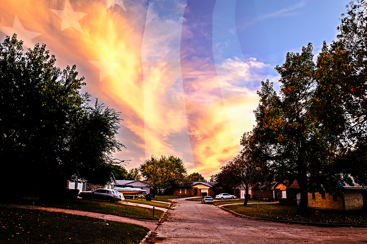
I really like the idea but to me the main image is too contrasty and dark which makes the image and the overlay look like to different images that compliment each other. One other little nitpick is maybe moving the overlay slightly to the right and blending the right edge to take away the sharp edge of the overlay. I think with a few tweaks this would be a very nice image. |





 Add photograph to your favorites
 Add photographer to your favorites



 Photographer found comment helpful.


