| Author | Thread |
|
|
11/03/2004 12:15:16 AM |
|
Eram sigur ca-i mioritza peacolo pe undeva :)) |
|
Comments Made During the Challenge  |
|
|
11/02/2004 07:27:01 PM |
|
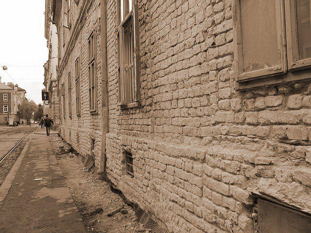
I like your idea but it seems just a bit unbalanced to me. I also don't care for the use of the sepia/duotones, I think if the bricks are actually brick red color it would have made it more interesting |
|
|
|
10/31/2004 04:05:53 PM |
|
like angle of wall and focal point on person |
|
|
|
10/31/2004 01:22:49 PM |
|
Looks familiar, somehow... |
|
|
|
10/30/2004 04:57:26 AM |
|
more classified as historical heritage than poor zone |
|
|
|
10/29/2004 03:40:59 PM |
I think it would've been interesting to make a shot of the building on the left only. The eyes are directed towards the fine building in the background so it doesn't leave the impression it is poor street indeed. The building on the left with its texture, old windows, etc. is just perfect for the challenge topic. I like duotone here as it makes the texture of the wall stronger. 7 for me.
Edited: Building on the right for God's sake.... Sorry for the mistake and congratulations with your top 50 placement.
Message edited by author 2004-11-05 18:55:02. |
|
|
|
10/29/2004 06:11:19 AM |
|
It looks poor maybe from neglect, it does need money spending on it but the city etc..........I see the story. |
|
|
|
10/29/2004 12:21:13 AM |
|
I like this one. The lines on the wall taking most of hte image has a really closed-in feeling. I feel that is appropriate for the challenge. But I think mostly I just like it. (8) |
|
|
|
10/28/2004 01:37:00 PM |
|
I like your picture... good focus and nice in sepia... only thing I would croped first window out. |
|
|
|
10/27/2004 06:22:37 PM |
|
nice tones ,but i feel field of view is constrained. |
|
|
|
10/27/2004 06:17:10 AM |
|
Home -
Challenges -
Community -
League -
Photos -
Cameras -
Lenses -
Learn -
Help -
Terms of Use -
Privacy -
Top ^
DPChallenge, and website content and design, Copyright © 2001-2026 Challenging Technologies, LLC.
All digital photo copyrights belong to the photographers and may not be used without permission.
Current Server Time: 07/01/2026 02:03:57 AM EDT.