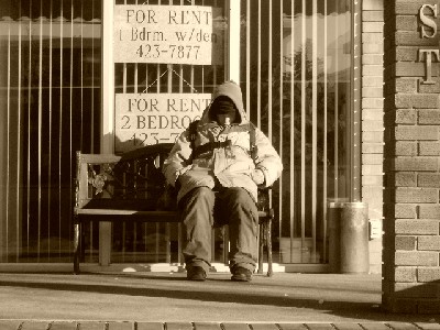
Sepia is a good choice here. I would prefer to see the guy moved more to the left or right. (rule of thirds) as this would certainly help with the composition.
I also find the image a little to small to really see what is going on here.
Like the sepia. Subject too centered for my taste. If you could cropped it to the left and get rid of that pole (wall) would be better IMO. Than the size is too small to judge it correctly
I like the colour and lighting, feels a bit too set-up. The clothing and shoes look too clean for true representation of the subject. However, it does convey the expected look for Poverty. Good Luck.
A homeless man in front of signs selling homes that he can not afford. That is poverty. And I like the black and white, I get the feeling this image would not have worked nearly as effectivly in color.






 Add photograph to your favorites
 Add photographer to your favorites


