I have a feeling you were inspired by the Implied Lines Challenge :)
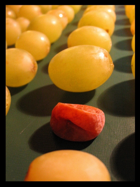
I get the idea of the photo (I hop so). The problem is, the red fruit looks totaly different, not poor, although I guess it is the same type. At first I thought it's a bit of carrot.
Generally - it is definately different than poor child or a homeless person. Absolutely in line with the topic. Just the colours make it sooo optimistic. It's more like "Differentiate" than "Poverty". For the idea and execution I give it 7.
Thank you for the lesson in symbolism, I had forgotten. I enjoy all the colors and the texture of the green surface. To me this is a great way to get the point across without taking the picture of someone less fortunate or their home. I like how the green grapes are plump and round, like they are fat and bursting in their opulence. I also like the lines and the thought it reveals you put into it.
I'm also glad the impoverished grape is red and sort of deflated, and you didn't just thow in a raisin. :)
I like the repitition of pattern. The border is a little jarring in its blackness. Perhaps a different tone would be more pleasing, or a second stripe in a different color.





 Add photograph to your favorites
 Add photographer to your favorites


 Photographer found comment helpful.


