| Author | Thread |
Comments Made During the Challenge  |
|
|
06/07/2015 12:24:20 PM |
|
 Photographer found comment helpful. Photographer found comment helpful. |
|
|
06/07/2015 11:08:07 AM |
|
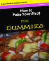
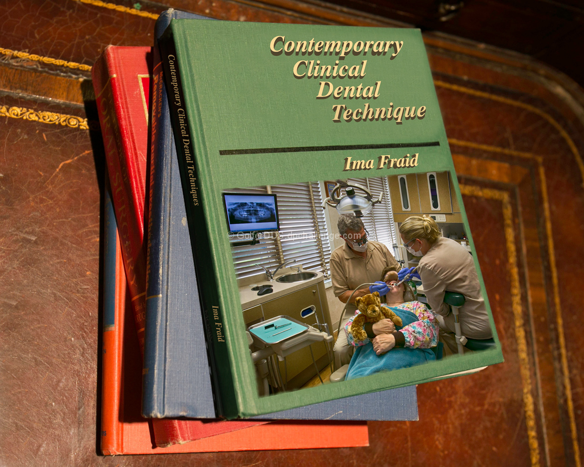
I remember when dentistry was a true discipline. The goal of the dentist was simple health and hygiene and nothing more. Postmodernism is the worst thing that ever happened to dentistry in my humble opinion. I would never go to a dentist who bought this book. In fact, after reading Chapter 3, *Anything can be a "Tooth"* and Chapter 4, *All Tooth is Relative*, I may never go to any dentist ever again. |
|
| Photographer found comment helpful. |
|
|
06/04/2015 05:17:57 PM |
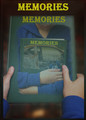
I really like your idea, but the execution makes it look too fake - it all looks too "photoshopped"...... a bit more photoshopping could have fixed that.
Just to mention one example - the text on the spine. It isn't quite in the right position (too far up), and it is way too bright. Being on the side of the book that is very much away from the light, the font, too, needs to be darker/duller.
But I do like your choice of a "carelessly" arranged pile of books. |
|
| Photographer found comment helpful. |
|
|
06/01/2015 10:04:40 AM |
Unique take on the challenge. I like the idea.
FYI, I think if you would have lowered the opacity of the phone and text a bit, it would blend in with the texture of the book and look a bit more real. |
|
| Photographer found comment helpful. |
Home -
Challenges -
Community -
League -
Photos -
Cameras -
Lenses -
Learn -
Help -
Terms of Use -
Privacy -
Top ^
DPChallenge, and website content and design, Copyright © 2001-2026 Challenging Technologies, LLC.
All digital photo copyrights belong to the photographers and may not be used without permission.
Current Server Time: 06/30/2026 09:18:31 AM EDT.