DPChallenge: A Digital Photography Contest You are not logged in. (log in or register
 
Challenge Entries
Portfolio Images
This image is not part of a public portfolio.
Control
Control
welcher


Photograph Information Photographer's Comments
Challenge: Square (Classic Editing)
Camera: Canon PowerShot S40
Location: Home
Date: Jan 23, 2003
Aperture: f/2.8
ISO: 50
Shutter: 1/4
Galleries: Still Life, Macro
Date Uploaded: Jan 23, 2003

I swear, I didn't see the volkswagen commercial with a keyboard key on it till after I had the idea!

I also like the subtle anti-microsoft message here, even though I'm a happy Microsoft user.

Statistics
Place: 165 out of 179
Avg (all users): 4.1170
Avg (commenters): 4.1667
Avg (participants): 3.9455
Avg (non-participants): 4.3590
Views since voting: 744
Votes: 188
Comments: 8
Favorites: 0


Please log in or register to add your comments!

AuthorThread
02/09/2003 04:05:06 PM
CRITIQUE CLUB CRITIQUE
by karmat

(Just for the record, I haven't seen the commercial you are referring to!)
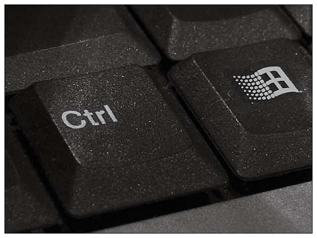
COMPOSITION
I think you have placed the subject(s) in the frame well. You have avoided "centering" them, and have set them at a dramatic angle. I do think, that cropping the control key similarily to the microsoft key would make it seem more balanced, maybe. Perhaps including a bit more of the bottom of the keyboard would be more effective as well.

TECHNIQUE
I think the lighting and focus work well here. There does seem to be a bit of glare, so maybe diffusing the light with a thin cloth or tissue, if you don't have a diffuser, might work. Otherwise, there is not a lot you can do. It seems a small thing, and nit-picky, but the hair/lint does detract a little. Noticing details like that can really help, especially on sites like this.

OVERALL EFFECT
Personally, though the technique and composition make this a relatively strong picture, it doesn't pull a lot of emotional appeal, I think. It met the challenge well, and it was something that was familiar to all of us, maybe too familiar. I think you needed something "extra" to set yours above the rest. You also suffered from the fact that there were other keyboard pictures, and that, unfortunately, is not your fault. Maybe if you could have added something to make yours even more unique, more viewers would have liked it more. Again, it is a well taken photograph, and meets the challenge well.
  Photographer found comment helpful.
 Comments Made During the Challenge
01/30/2003 10:31:34 PM
Nice sharp macro. The hair on the Windows button is a distraction. There seems to be some sort of glare rising from the control key as well.
01/29/2003 08:30:59 PM
Too many keyboard shots - not a lot of originality.
01/29/2003 02:14:18 PM
Nice job on getting the images to come out very clear. I think that if you would have focused cloe up on the key would have given it more intrest to the picutre. Also the dirst on the keys brings more intrrest to the picture.
01/29/2003 10:30:46 AM
you image wasn't very cretive its very plain
01/27/2003 09:49:49 PM
People love their keyboard shots I must say! But having the windows logo in the frame. Yuck! :) jgillard5
01/27/2003 08:02:35 PM
too much detail-those spwecks are not attractive, IMO
01/27/2003 02:00:26 AM
My god this is terrible. I hate keyboard key pictures. I will say that the picture is very good focus however.


Home - Challenges - Community - League - Photos - Cameras - Lenses - Learn - Prints! - Help - Terms of Use - Privacy - Top ^
DPChallenge, and website content and design, Copyright © 2001-2024 Challenging Technologies, LLC.
All digital photo copyrights belong to the photographers and may not be used without permission.
Current Server Time: 04/20/2024 02:07:05 AM EDT.