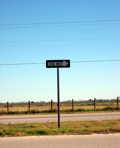
Colors are a bit washed out, everything seems a little tilted. Subject of photo does little for me. Power/phone lines really distract from the image. 3 md
There's something to be said for keeping the composition simple and the content minimal, but I think you'd have done better to exclude more of the background here. I like the fence and the sign, but the power lines are a major distradtion.
A simple photo - which works well, I really like the concept. The sign looks just a little bit blury unfortunately (but perhaps it's just my eyes when I look closer). The power lines are a little distracting - especially the one passing through the sign.
Good color and focus. Too bad about the wires, oh well..... I'm not getting much connection to this shot (can't tell if I need to see more or less or maybe additional props (cars? maybe?) (A hay wagon would be really cool!) 7 Swash






 Add photograph to your favorites
 Add photographer to your favorites


