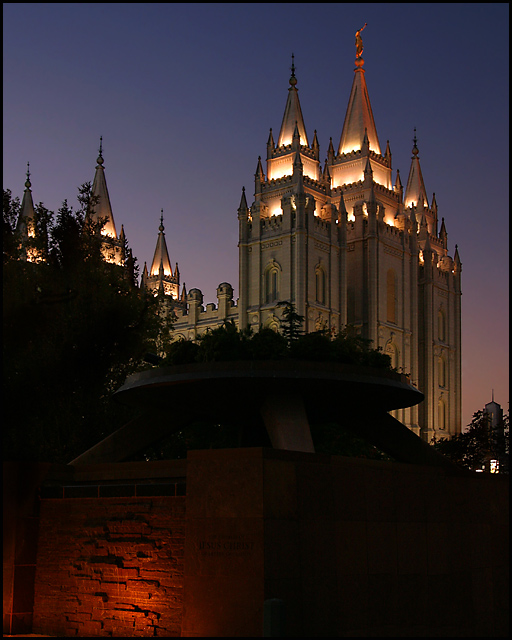
Ya know... for me, the touch of red down in the corner just kinda "balanced" the picture. I can tell from the many responses that most did not agree, but a few did.
Ilike the glow of the temple in front of the darkenning sky, but the dark outlines suggest you have oversharpened. I am also not sure why you include the large dark thing in the foreground. There is not enought detail for me to get a sense of wht it is and how it relates to your subject
I hesitate to offer a suggestion because I am still so inexperienced, but I personally would have liked it better if the brick thing at the bottom had been cropped out. The top part of the photo is beautiful!
I like this but think it could be cropped quite a bit on the bottom to emphasize the diagonal line of the wall and the jaggy building spires. The light on the bottom does not enhance the composition.
Wonderful image, as a personal choice I would of probably cropped out from the bottom of it, because that part is not so inbteresting and it distracts the eye. But that's just my choice your image is wonderful.
The lights on the temple are really good and the angle of view gives it a "majestic" feeling. IMO, I would have cropped out the red light to the bottom left. It doesn't really add anything to the photo and draws your eyes from the main subject. Beautiful shot though.
oooo, I love the Salt Lake temple, it's a brilliant choice for photography, I hope there's an other night challenge around the holidays, so you can get it with all the lights. I wish that large structure wasn't in the way though, it's kind of obstructive.






 Add photograph to your favorites
 Add photographer to your favorites

 Photographer found comment helpful.


