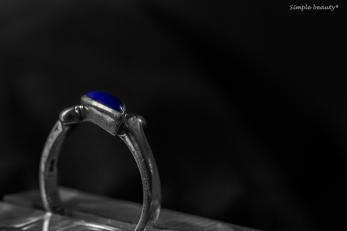
I like the concept here...
I wish the blue stone had a highlight or sparkle on the top left to really make your jewelry take over the image.
As it is, the lower left is the bright spot that my eyes keep going to...
Perhaps if you'd cropped it as a magazine ad, cropping out all of the stuff the ring is sitting on and then had your clever text still in the upper right? |





 Add photograph to your favorites
 Add photographer to your favorites


 Photographer found comment helpful.


