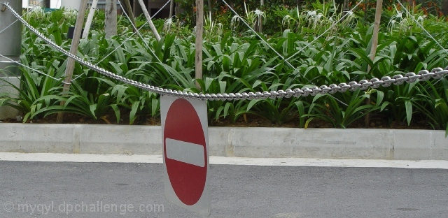
I am nut quite sure what is going on in this image. On my monitor (well, both my monitors, actually, so I don't think it is the monitors fault), the lines look jagged. Both the cirvle on the sign, the line through it, the wooden stakes in the background... Etc. Also, I have the most serious doubts in the world if this sign was taken on f/4.0. The background - and several meters behind - are completely in focus. The only way this could have been taken with f/f is if you were standing very far away from the sign.
My tip would have to be: Go a lot closer, use your widest (i.e smallest number) aperture, and throw shte background out of focus that way. You also write that you used unfamiliar tools, and my tip for that would be.. eh.. don't ;) That is probably the reason for the jaggedness.
When all of that is whined about; Interesting composition, and great contrast in colours.. Good work.
The sweep of the horizontal lines go well with the panoramic format. The greenery softens the edge of modern age. If the viewpoint was a little lower perhaps the white portions of the sign would not blend in with the curb but contrast against the plants instead ( a small suggestion). What do you think of placing the sign a bit more off center? Otherwise a good solid shot.
Unfortunately this sign really hides against the gutter and road - only the chain led my eyes to it. The plants take my attention because they are so much brighter. Focus and exposure are good, and I like the aspect ratio you chose for the final image (I hate square images normally).
looks like a chasity belt protecting the garden of eden. would have liked to see the red and greens seem a little sharper (increase the saturation in post processing)





 Add photograph to your favorites
 Add photographer to your favorites

 Photographer found comment helpful.


