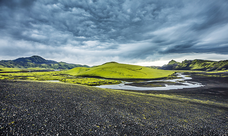
I shot this image on a recent hike in the south of Iceland. The weather was bad, raining off and on and the skies were just too dramatic. Once I caught a glimpse of this moss covered hill surrounded by water I was in awe.
Processed in lightroom and sharpened and resized in photoshop.
Statistics
Place: 101 out of 177 Avg (all users): 5.7545 Avg (commenters): 7.1429 Avg (participants): 5.7558 Avg (non-participants): 5.7500 Views since voting: 397 Views during voting: 179 Votes: 110 Comments: 8 Favorites: 0
This image has so much going for it and yet it only managed to grab attention from selected people. As an avid landscape photographer myself I always am over analytical and forgive me if Im doing this on your image but ill attempt to first say what works, what don't work and then venture on possible ways in which it could have been improved. This purely hypothetical as its always easy to make comments on an image when you were the only person there and truly know what this case is, could have worked and the viability of my suggestions
Iceland always gets peoples attention. They expect something special. Something out of this world. This scene does have that. Contrast galore - also noted by others. The blacks, greens and then grey black sky works well. The clouds does help in generating a mood and atmosphere in this scene always good for landscape work. You tried to present the viewer with same feeling you had when you first saw this. I believe you have succeeded in doing this but only limited. The comp is not entirely there for this kind of landscape. It is pleasing but im finding myself glued to the green hill and thats it. Black in the front and moody clouds... But then back to the green hill and there is not much else. Yes pleasing.. But expecting more but not getting it. No lines that allow me to flow with the scene. You have lines in the fg as well as sky line and circles in the middle with river and hill strengthening this but these are not working together.
Processing looks good but it does look like the clouds have been worked on a bit and maybe some voters saw this as over the top? It almost looks like it has an HDR effect.
So what could have been done differently? Comp wise i cant say apart from suggestions as made above... You know what it looks like there and must play around with the elements before you and wow do you have elements to work with!!! I dont think Ill make much progress with the hike if I could visit this place. To much to appreciate.
Possible things you could have opted for.
Tripod. Drop that f stop and get some more depth and sharpness throughout. FG could do with some more interest and a lower angle would have brought the viewer in touch with the scene and be involved and not a mere spectator. Having done the above Im already seeing the effect that a slow shutter would have in helping solve the problem with my drifting clueless eyes.. Where the clouds will have movement creating a sense of direction and pulling me in.. Even be it sideways. This will also play right in to the contrast theme you have here.
Hope the above helps a little. These are merely one persons observations and suggestions and you should always stay true to your own style but also appreciate the basics that help your vision and creativity come to the fore.
Regards
Rian
I love the moodiness of the clouds in this and the contrast with the green. I think I may have preferred it if some of the foreground had been cropped as I think it detracts from the hill.






 Add photograph to your favorites
 Add photographer to your favorites

 Photographer found comment helpful.


