OK, Here goes (In Paint Shop Pro 7):
1. Crop,
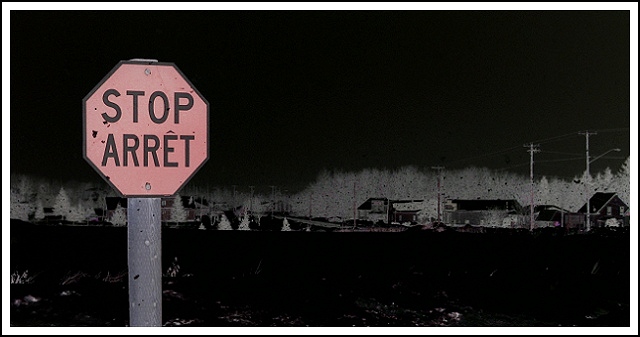
2. Brighten in Histogram Function (wanted snow and sky real white)
3. Convert to Negative Image
4. Adjust Hue/Saturation -- Convert Cyan to Red
5. Resize
6. Sharpen, Sharpen (yes, twice)
7. Add Border 8 pixels (white)
8. Add Border 2 pixels (black)
It was snowing, and the sky was covered + I only had about 2 hours of daylight to play with (Sunday). Really learned alot this time around. Experimented quite a bit. Found out that you can swap colours using the Hue/Saturation adjustment. Any questions, e-mail me. I finally learned my complementary colours too. :)
Statistics
Place: 129 out of 174 Avg (all users): 4.8889 Avg (commenters): 5.5000 Avg (participants): 4.7156 Avg (non-participants): 5.1011 Views since voting: 1447 Votes: 198 Comments: 10 Favorites: 0
Critique Club Critique
(1) COMPOSITION (CONTENT) – The over composition of the photo is quite good. The sign is well positioned and of appropriate size to draw the eye.
(2) BACKGROUND – Good. Does not intrude on the photo. The sky acts as good negative space. Only minor comment would be on the centered horizon. Impact may have been higher with a lower horizon.
(3) CAMERA WORK ,TECHNICAL – Good. Good focus and DOF throughout.
(4) DIGITAL PROCESSING ,TECHNICAL – This was one of the features that sets your photo apart. An artistic interpretation. The final result really draws the eye to the sign, and reduces the whole background to a secondary part of the photo as you intended. If there is a negative here, it’s that the sign is an off –red.
(5) MY OPINION ON THE PHOTO – A very nice photo that attempts to differentiate itself from the crowd, and does so. The only major negative, in my opinion, is the color of the sign – should have been more red. But tough to do under the challenge rules. Deserves a much higher score imho.
Spooky stuff. A bit sinister for my taste. But what the hey, it's a different style with it's own speaks. Like a bittersweet licorice kiss. Grows on you after a while. Unusual and inspiring.





 Add photograph to your favorites
 Add photographer to your favorites

 Photographer found comment helpful.


